The redesigned homepage exceeded our expectations. It communicates our platform clearly, highlights our key solutions effectively, and provides a much better experience for restaurant owners exploring our product.

Omer Choudhary
Founder & CPO, Truffle
The redesigned homepage exceeded our expectations. It communicates our platform clearly, highlights our key solutions effectively, and provides a much better experience for restaurant owners exploring our product.
Omer Choudhary
Founder & CPO, Truffle
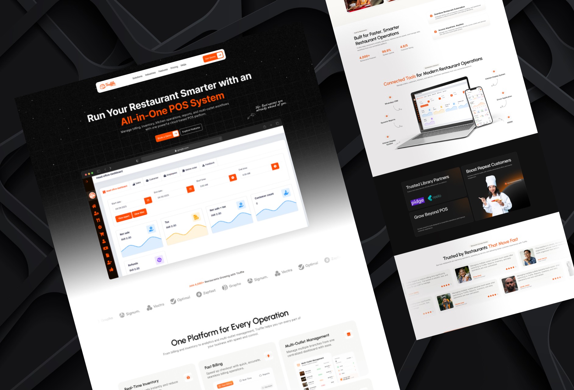
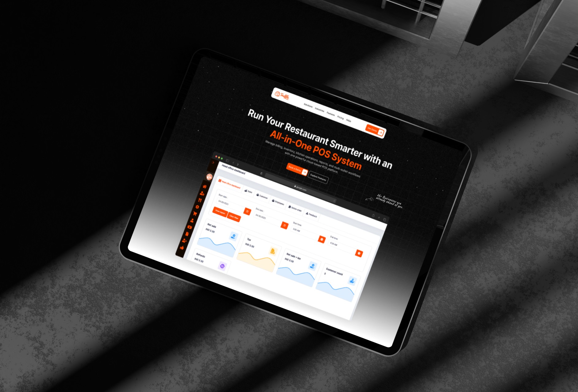
This project focused on redesigning the homepage of a restaurant POS platform serving restaurants, cafés, cloud kitchens, and multi-outlet businesses. The objective was to improve content hierarchy, product communication, and user engagement while creating a modern and professional digital experience.
This project focused on redesigning the homepage of a restaurant POS platform serving restaurants, cafés, cloud kitchens, and multi-outlet businesses. The objective was to improve content hierarchy, product communication, and user engagement while creating a modern and professional digital experience.
Improving Product Communication
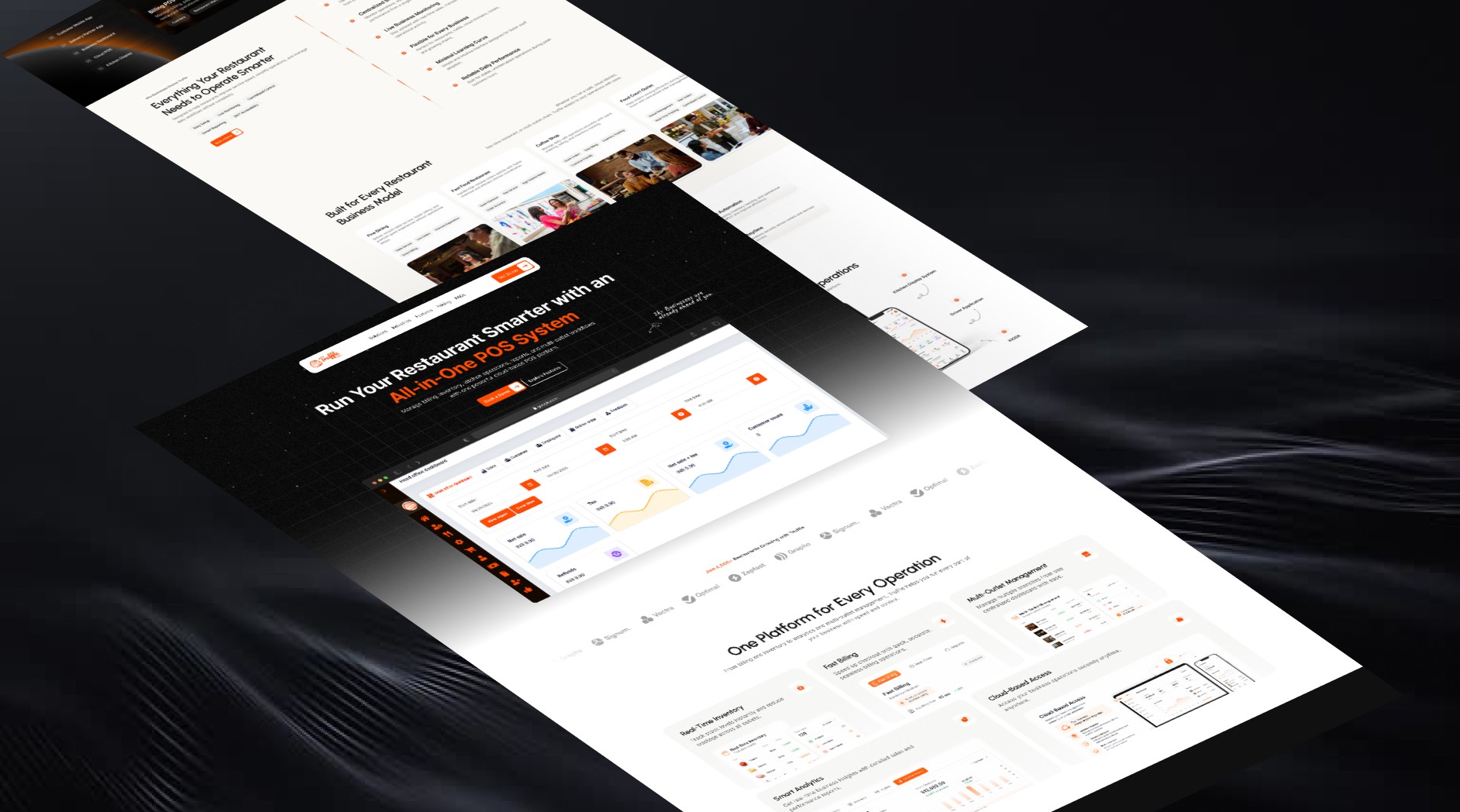
The homepage was redesigned to clearly explain the platform's features, benefits, and solutions for different restaurant business models.
I started by reviewing the existing homepage structure and identifying areas where product information felt scattered or difficult to understand. The new layout introduced a clearer hierarchy that highlighted key features such as billing POS, inventory management, analytics, cloud access, and multi-outlet management. Content was reorganized into focused sections, helping visitors quickly understand the platform's value and how it supports restaurant operations.
Improving Product Communication
The homepage was redesigned to clearly explain the platform's features, benefits, and solutions for different restaurant business models.
I started by reviewing the existing homepage structure and identifying areas where product information felt scattered or difficult to understand. The new layout introduced a clearer hierarchy that highlighted key features such as billing POS, inventory management, analytics, cloud access, and multi-outlet management. Content was reorganized into focused sections, helping visitors quickly understand the platform's value and how it supports restaurant operations.
Creating a Conversion-Focused Experience
The redesign focused on improving visual hierarchy, user flow, and trust-building elements to encourage more demo bookings.
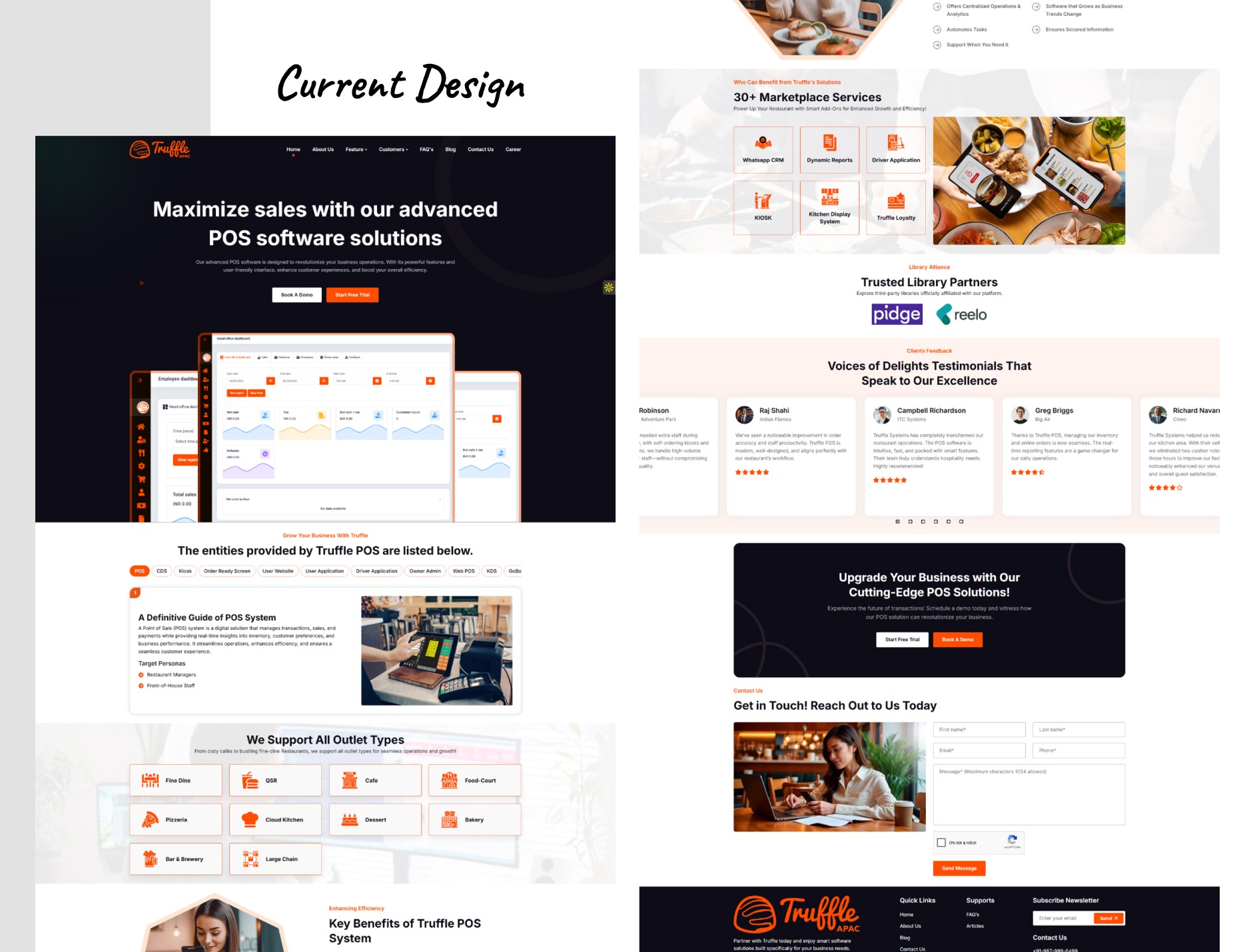
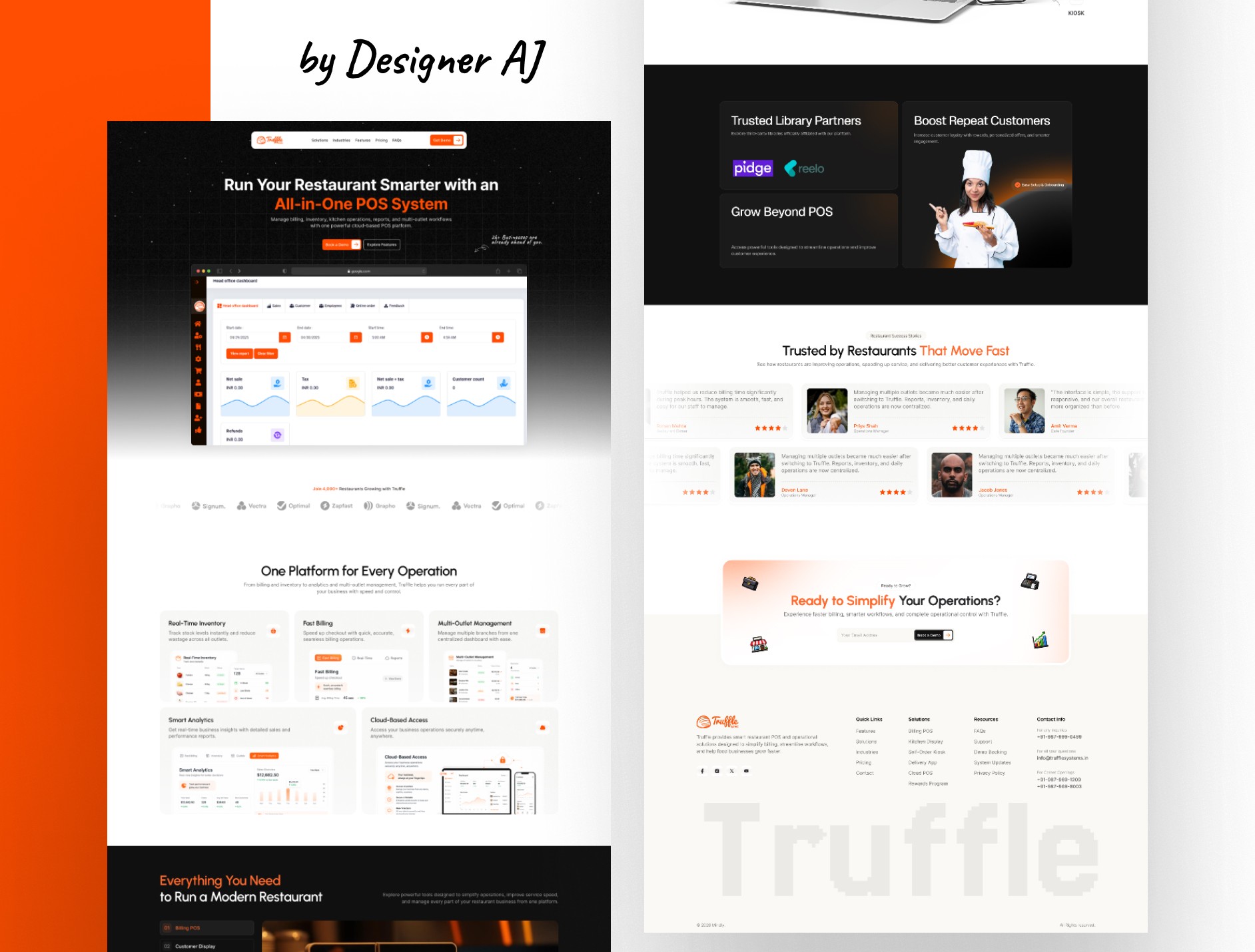
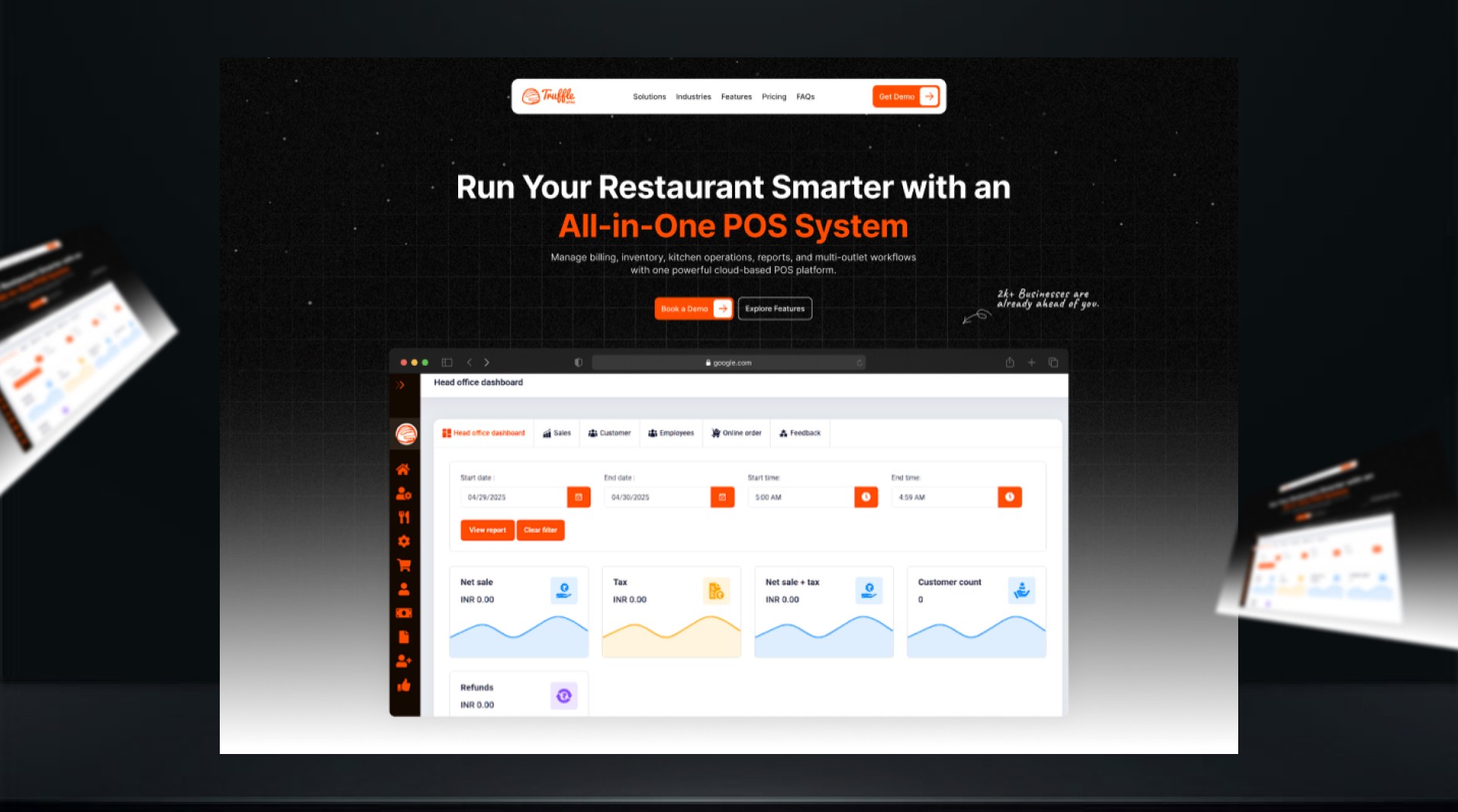
The interface was redesigned using a modern layout, stronger call-to-actions, structured feature presentation, customer testimonials, business statistics, and industry-specific use cases. Product screenshots and operational workflows were given more visibility to demonstrate the platform in action. Before the redesign, information lacked a clear flow and key offerings were harder to discover. After the redesign, the homepage delivered a more organized experience that improved readability, strengthened credibility, and guided users toward booking a demo.
Creating a Conversion-Focused Experience
The redesign focused on improving visual hierarchy, user flow, and trust-building elements to encourage more demo bookings.
The interface was redesigned using a modern layout, stronger call-to-actions, structured feature presentation, customer testimonials, business statistics, and industry-specific use cases. Product screenshots and operational workflows were given more visibility to demonstrate the platform in action. Before the redesign, information lacked a clear flow and key offerings were harder to discover. After the redesign, the homepage delivered a more organized experience that improved readability, strengthened credibility, and guided users toward booking a demo.
Latest projects
Website
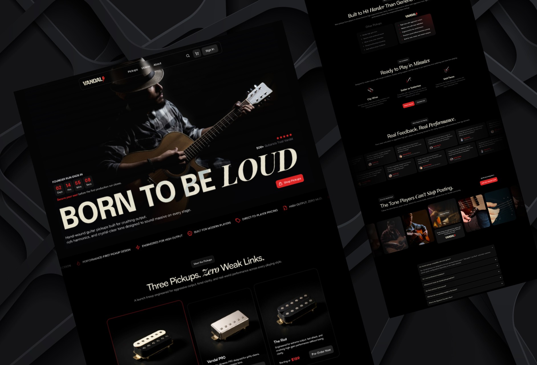
Designing a High-Impact Ecommerce Homepage for Guitar Pickups
Designed a conversion-focused ecommerce homepage for a premium guitar pickup brand, helping players explore products, compare options, and engage with the brand.
Website
Designing a High-Impact Ecommerce Homepage for Guitar Pickups
Designed a conversion-focused ecommerce homepage for a premium guitar pickup brand, helping players explore products, compare options, and engage with the brand.
Website
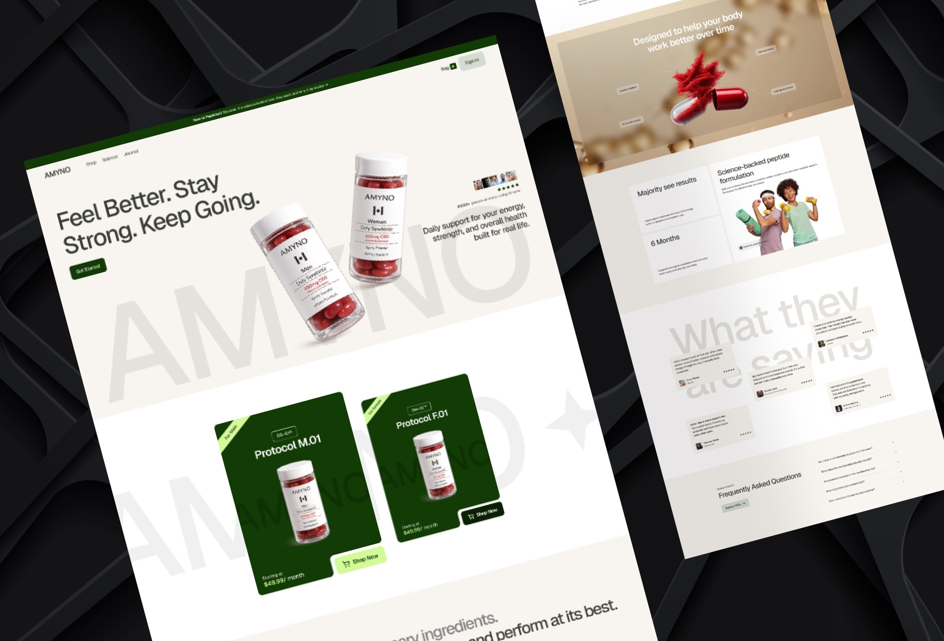
Designing a High-Converting Wellness Homepage Experience
Designed a modern wellness brand homepage from scratch to improve product understanding, trust, and conversion through a clear user journey.
Website
Designing a High-Converting Wellness Homepage Experience
Designed a modern wellness brand homepage from scratch to improve product understanding, trust, and conversion through a clear user journey.
Latest projects
Website
Designing a High-Impact Ecommerce Homepage for Guitar Pickups
Designed a conversion-focused ecommerce homepage for a premium guitar pickup brand, helping players explore products, compare options, and engage with the brand.
Website
Designing a High-Converting Wellness Homepage Experience
Designed a modern wellness brand homepage from scratch to improve product understanding, trust, and conversion through a clear user journey.