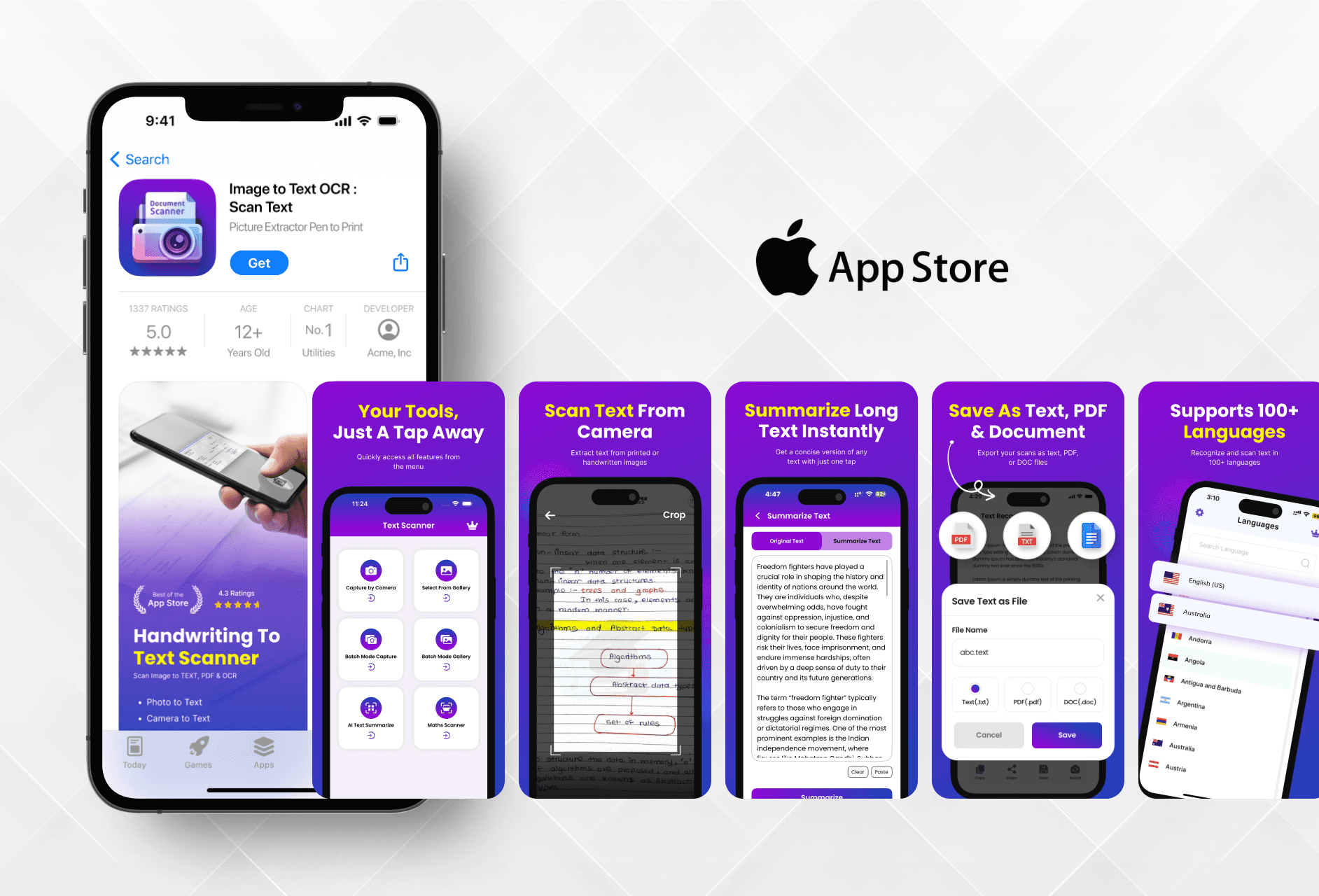
I aimed to highlight the app's core features in a clean and modern way, helping users quickly understand its use through simple and attractive visuals.

Ajay Jotangiya
UI/UX & Graphics Designer
I aimed to highlight the app's core features in a clean and modern way, helping users quickly understand its use through simple and attractive visuals.
Ajay Jotangiya
UI/UX & Graphics Designer
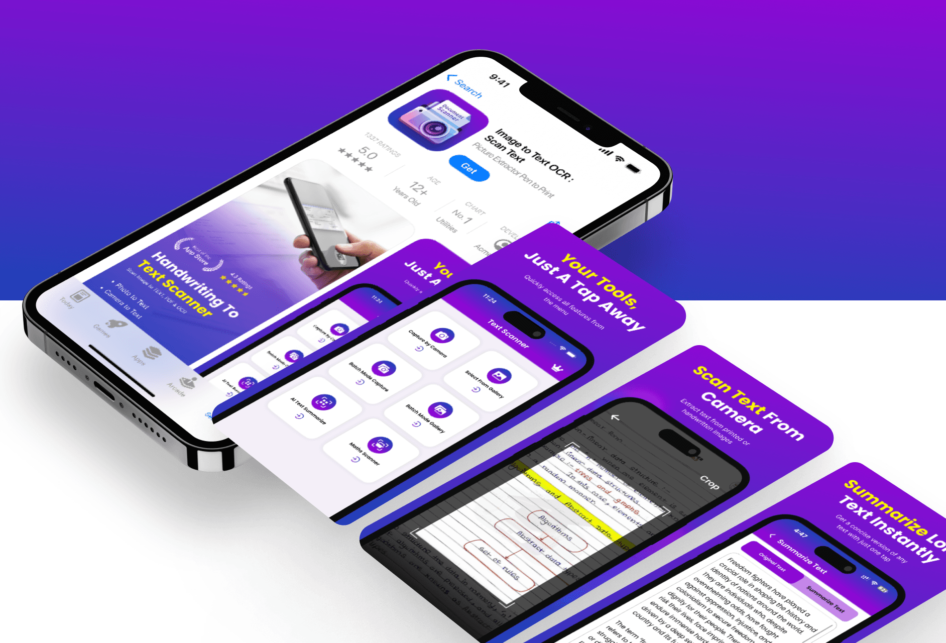
This was a freelance UI project for an OCR-based utility app called "Image to Text – OCR Scan Text". The goal was to redesign the App Store screenshots and icon to make the app look professional, easy to understand, and visually strong.
This was a freelance UI project for an OCR-based utility app called "Image to Text – OCR Scan Text". The goal was to redesign the App Store screenshots and icon to make the app look professional, easy to understand, and visually strong.
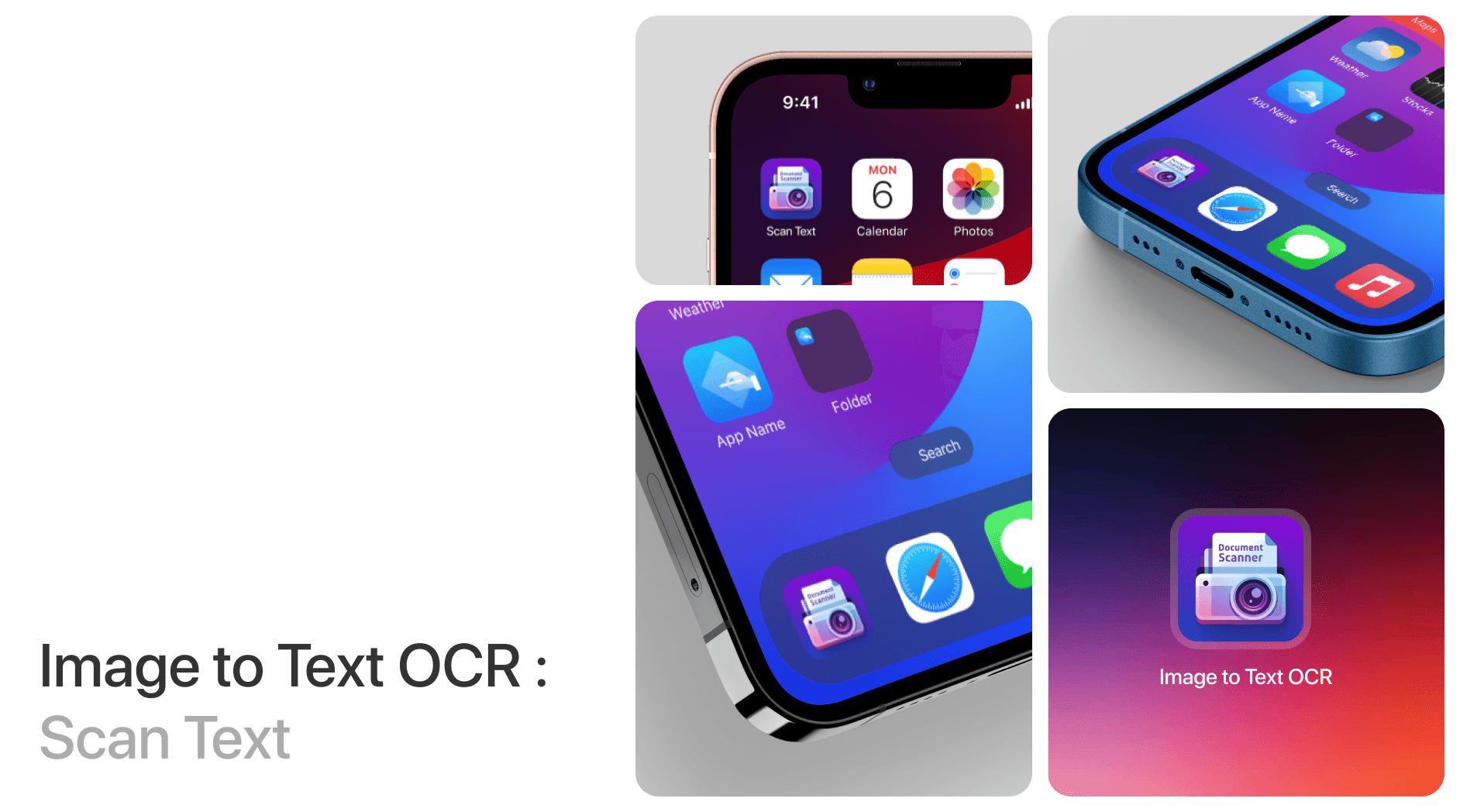
Creating Visuals that Guide Users
I redesigned the App Store screenshots by focusing on simple layouts and clear visuals that explain what the app does in just a few seconds.
The process began with checking what other similar apps were doing. I looked at top-ranking OCR and utility apps on the App Store and studied how they showed their features. After that, I followed the brand guidelines already used in the app to keep things consistent. Using Figma, I planned the layout of each screenshot to focus on one key action like scanning, extracting, or copying text. Photoshop helped me enhance visuals, and I used Illustrator to cleanly design the app icon. The end goal was to create an experience where users could understand the app’s value at first glance.
Creating Visuals that Guide Users
I redesigned the App Store screenshots by focusing on simple layouts and clear visuals that explain what the app does in just a few seconds.
The process began with checking what other similar apps were doing. I looked at top-ranking OCR and utility apps on the App Store and studied how they showed their features. After that, I followed the brand guidelines already used in the app to keep things consistent. Using Figma, I planned the layout of each screenshot to focus on one key action like scanning, extracting, or copying text. Photoshop helped me enhance visuals, and I used Illustrator to cleanly design the app icon. The end goal was to create an experience where users could understand the app’s value at first glance.
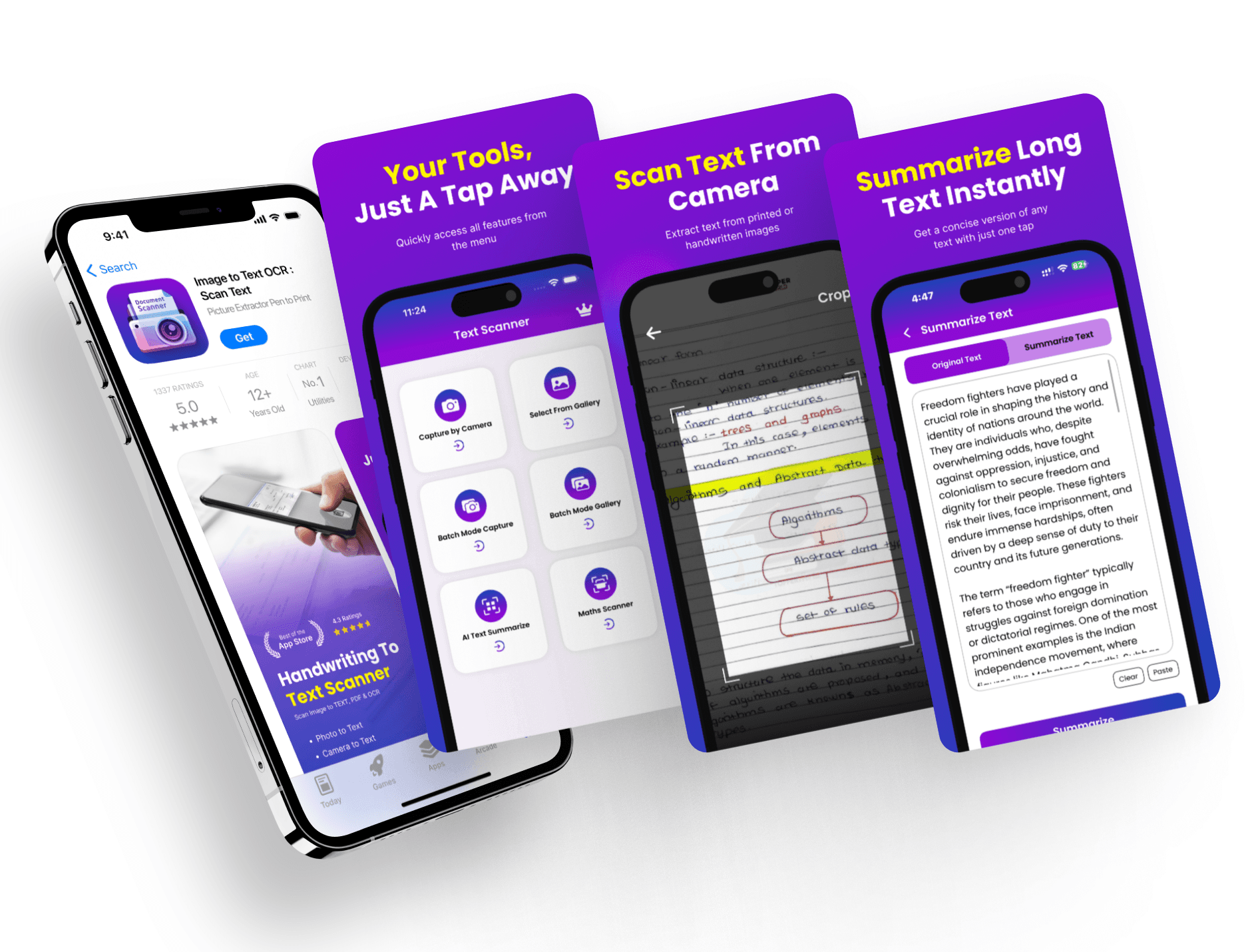
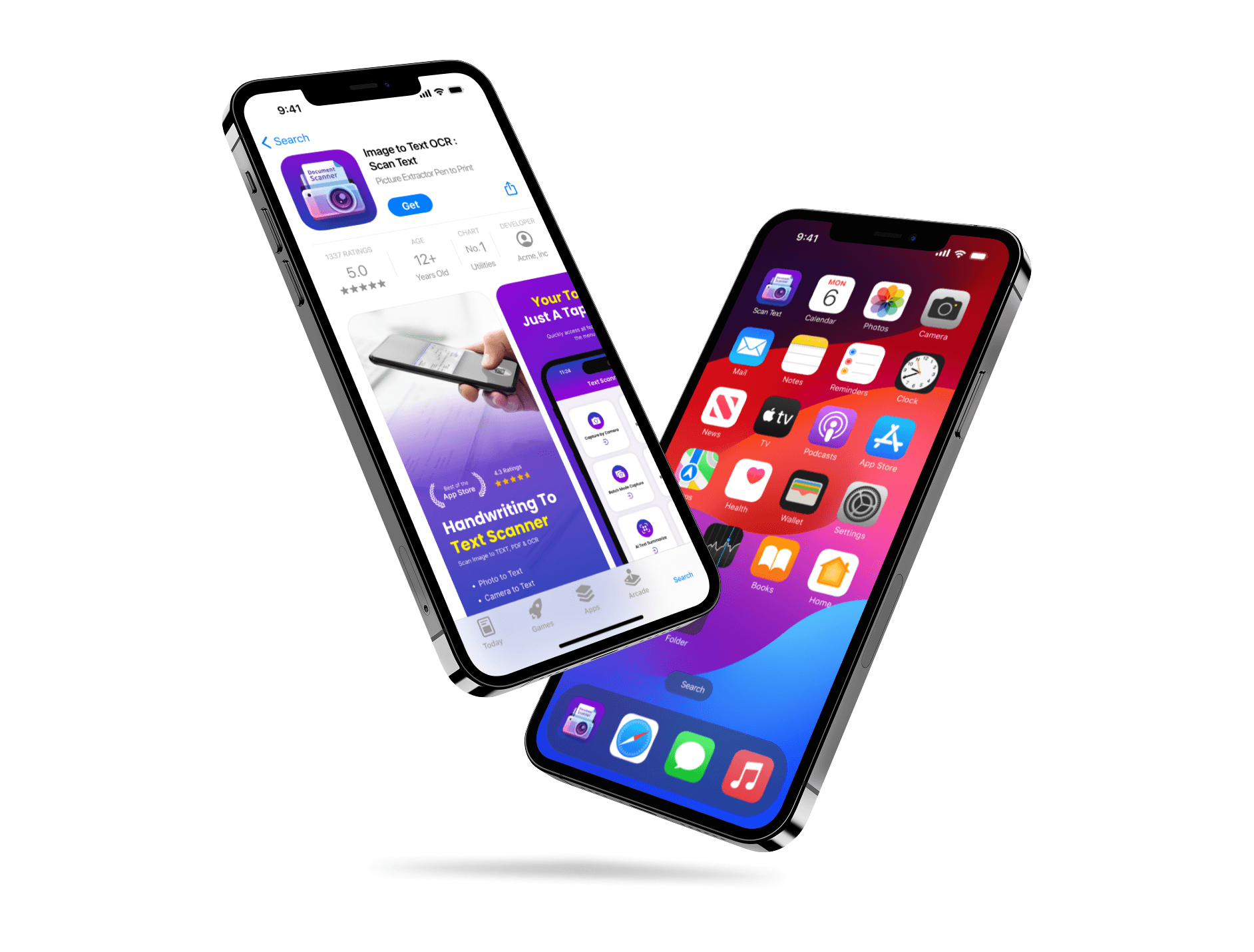
Making the Design Clean and Consistent
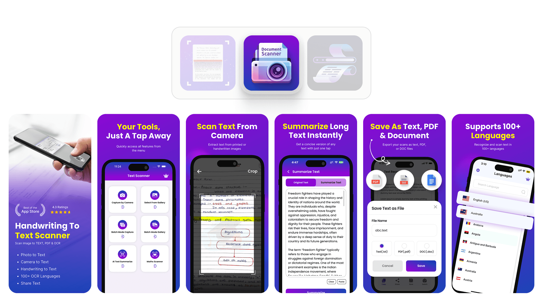
I made sure every screenshot followed a clean style, used the right colors, and highlighted one feature per screen for better user clarity.
Each screen was designed to feel connected while standing out individually. I used a consistent font, spacing, and color scheme throughout all assets. The icon design followed a minimal style to stay readable even at smaller sizes. Visual hierarchy was used so that headings and action visuals stand out first. There were no big content blocks or distractions. Before this, the screenshots felt cluttered and didn't explain the app well. After the redesign, the app looked more polished, and the visuals made it easier for users to understand the main features. This made the overall presentation stronger and aligned better with App Store standards.
Making the Design Clean and Consistent
I made sure every screenshot followed a clean style, used the right colors, and highlighted one feature per screen for better user clarity.
Each screen was designed to feel connected while standing out individually. I used a consistent font, spacing, and color scheme throughout all assets. The icon design followed a minimal style to stay readable even at smaller sizes. Visual hierarchy was used so that headings and action visuals stand out first. There were no big content blocks or distractions. Before this, the screenshots felt cluttered and didn't explain the app well. After the redesign, the app looked more polished, and the visuals made it easier for users to understand the main features. This made the overall presentation stronger and aligned better with App Store standards.
Latest projects
Website
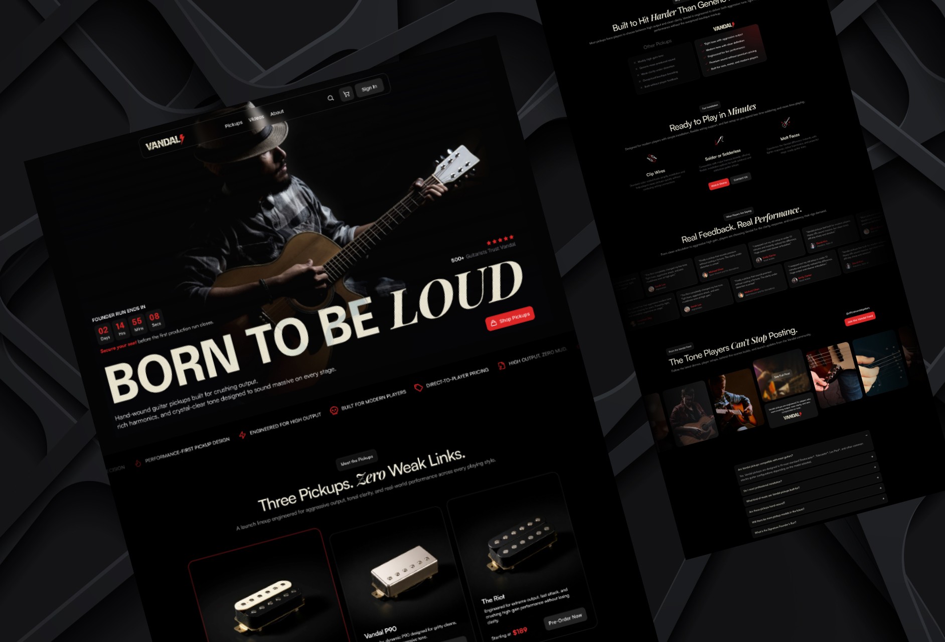
Designing a High-Impact Ecommerce Homepage for Guitar Pickups
Designed a conversion-focused ecommerce homepage for a premium guitar pickup brand, helping players explore products, compare options, and engage with the brand.
Website
Designing a High-Impact Ecommerce Homepage for Guitar Pickups
Designed a conversion-focused ecommerce homepage for a premium guitar pickup brand, helping players explore products, compare options, and engage with the brand.
Website
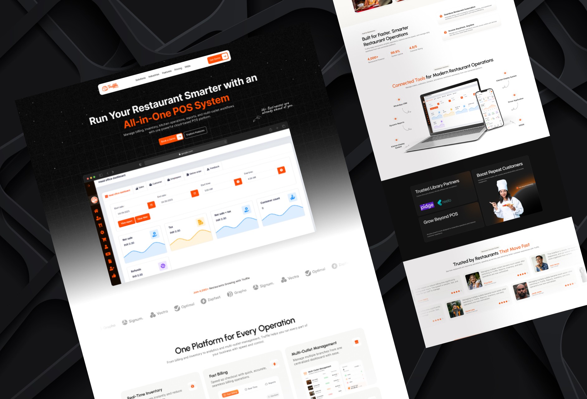
Redesigning a Restaurant POS Website for Better Conversion
Redesigned a restaurant POS homepage to improve product clarity, showcase platform capabilities, and create a stronger conversion-focused experience.
Website
Redesigning a Restaurant POS Website for Better Conversion
Redesigned a restaurant POS homepage to improve product clarity, showcase platform capabilities, and create a stronger conversion-focused experience.
Latest projects
Website
Designing a High-Impact Ecommerce Homepage for Guitar Pickups
Designed a conversion-focused ecommerce homepage for a premium guitar pickup brand, helping players explore products, compare options, and engage with the brand.
Website
Redesigning a Restaurant POS Website for Better Conversion
Redesigned a restaurant POS homepage to improve product clarity, showcase platform capabilities, and create a stronger conversion-focused experience.