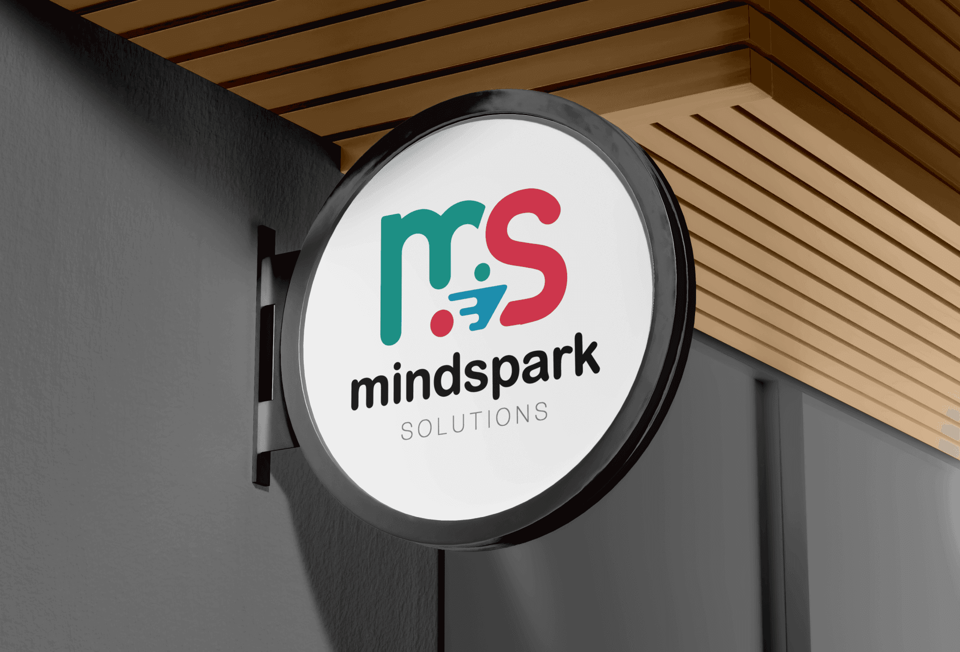
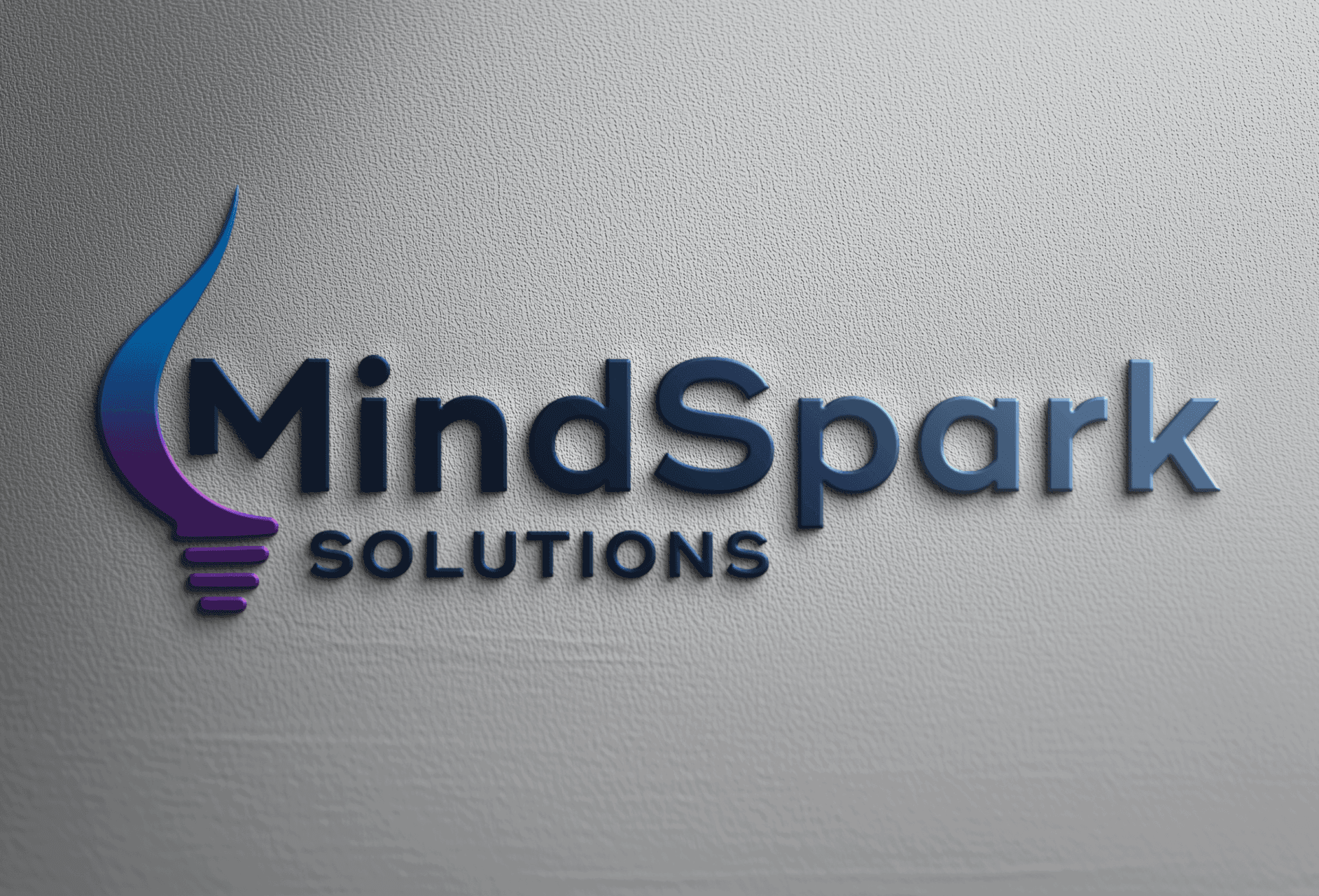
I aimed to bring out the identity of Mindspark by creating a logo that feels modern, playful, and highlights the core initials ‘MS’ clearly and creatively.

Ajay Jotangiya
UI/UX & Graphics Designer
I aimed to bring out the identity of Mindspark by creating a logo that feels modern, playful, and highlights the core initials ‘MS’ clearly and creatively.
Ajay Jotangiya
UI/UX & Graphics Designer
Mindspark is a new IT company that wanted a fresh brand identity. They needed a logo that looks modern and fun, yet professional. I created this logo from scratch with a focus on the MS initials.
Mindspark is a new IT company that wanted a fresh brand identity. They needed a logo that looks modern and fun, yet professional. I created this logo from scratch with a focus on the MS initials.
Understanding the Brand and Setting the Direction
The client didn’t provide much detail but wanted a playful and modern look. I decided to focus on representing the name Mindspark with strong visuals around the MS letters.
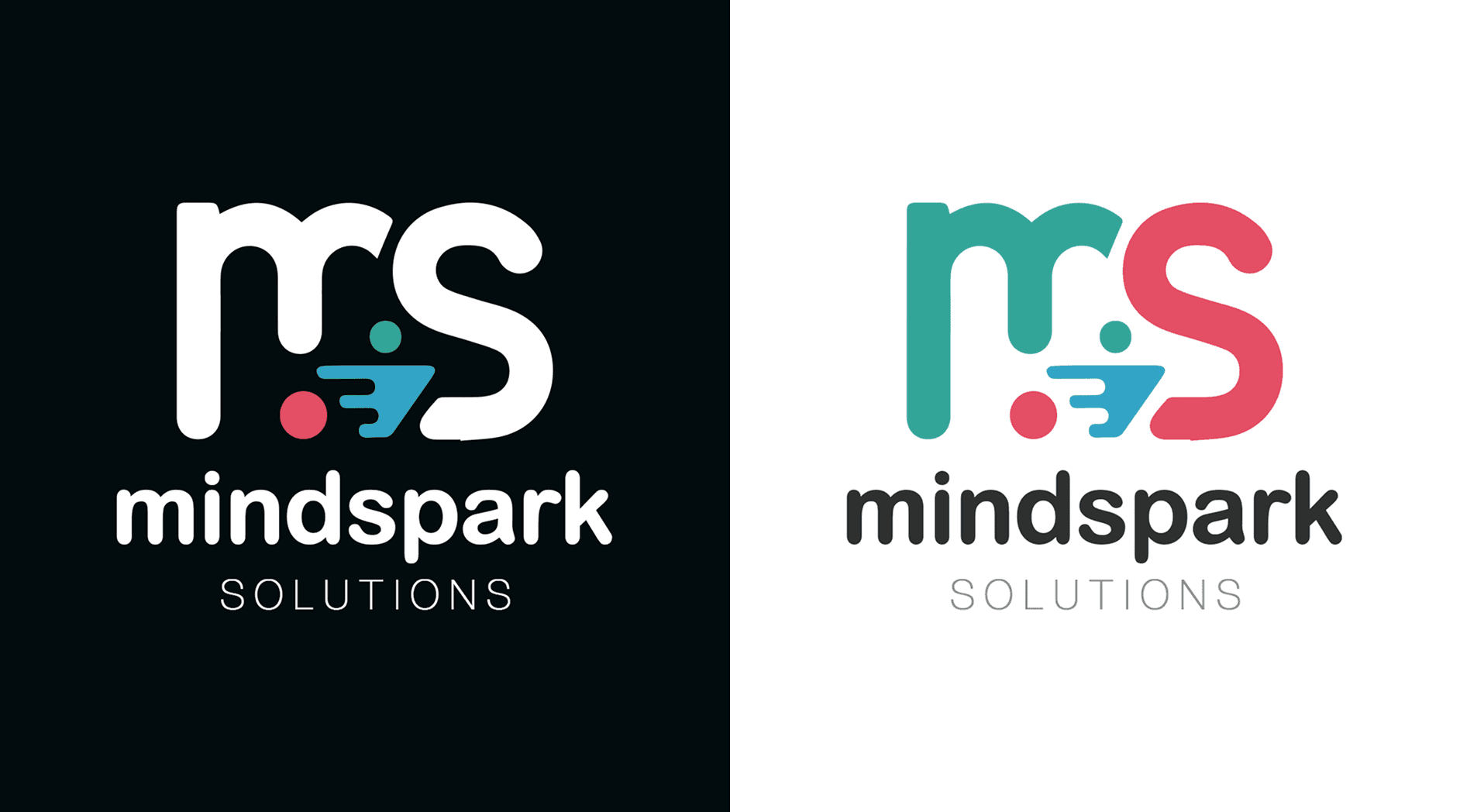
I started by understanding the startup's identity and thinking of how to bring playfulness into a tech-focused brand. Since the name itself has “spark” in it, I explored creative ways to reflect energy and innovation through the letterforms. I designed around 4 to 5 versions, playing with different styles, shapes, and color tones. After reviewing these, the client picked the version that balances fun with clarity. The rounded edges, soft colors, and simple type made it look friendly without losing its professional feel.
Understanding the Brand and Setting the Direction
The client didn’t provide much detail but wanted a playful and modern look. I decided to focus on representing the name Mindspark with strong visuals around the MS letters.
I started by understanding the startup's identity and thinking of how to bring playfulness into a tech-focused brand. Since the name itself has “spark” in it, I explored creative ways to reflect energy and innovation through the letterforms. I designed around 4 to 5 versions, playing with different styles, shapes, and color tones. After reviewing these, the client picked the version that balances fun with clarity. The rounded edges, soft colors, and simple type made it look friendly without losing its professional feel.
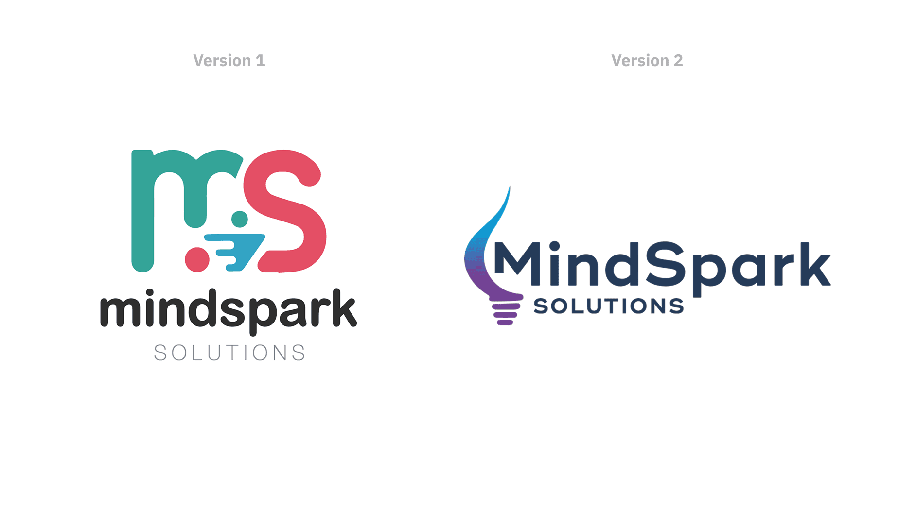
Logo Design Process and Final Outcome
The focus was on building the MS symbol in a unique yet clear way. I kept the rest of the brand elements aligned with the same tone.
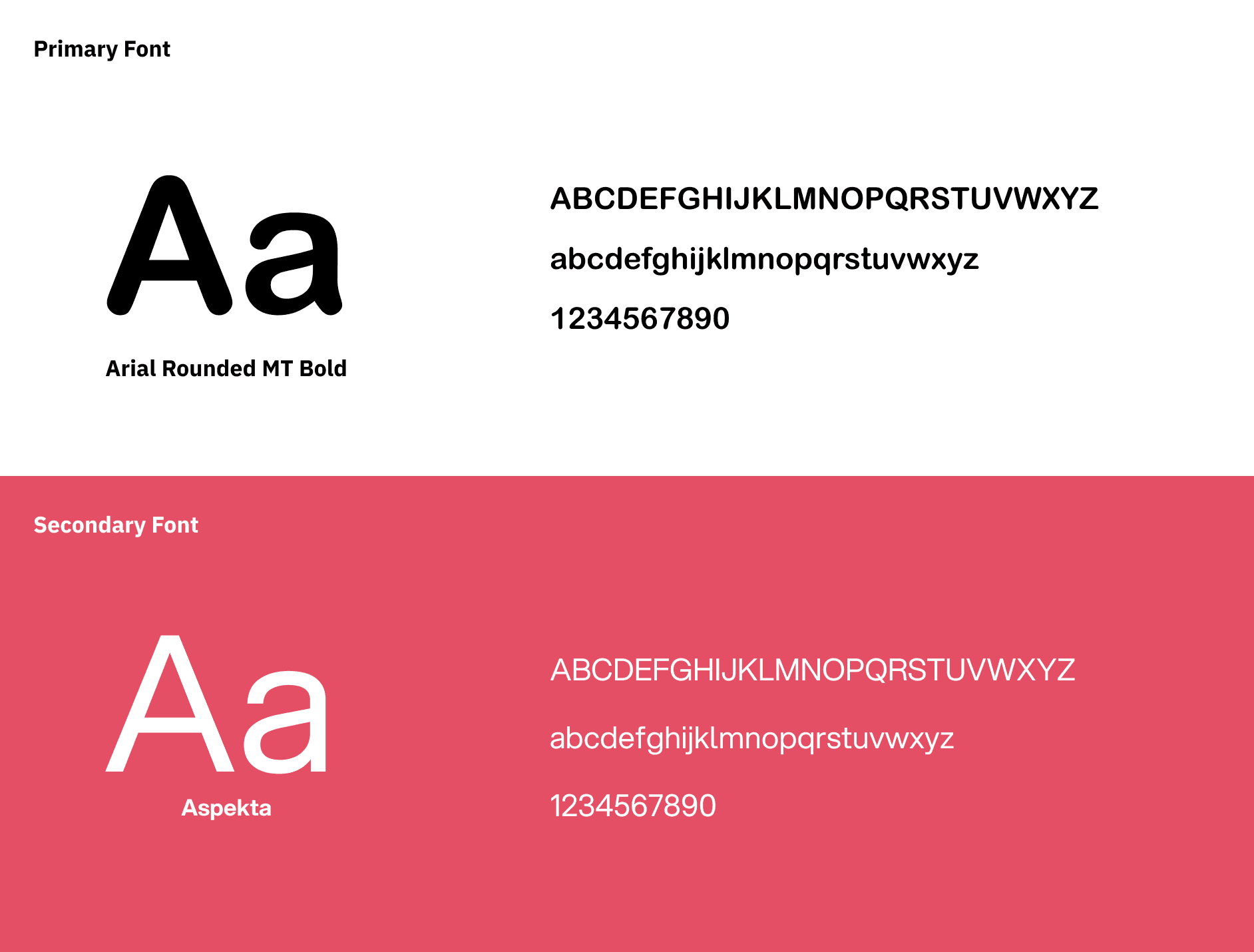
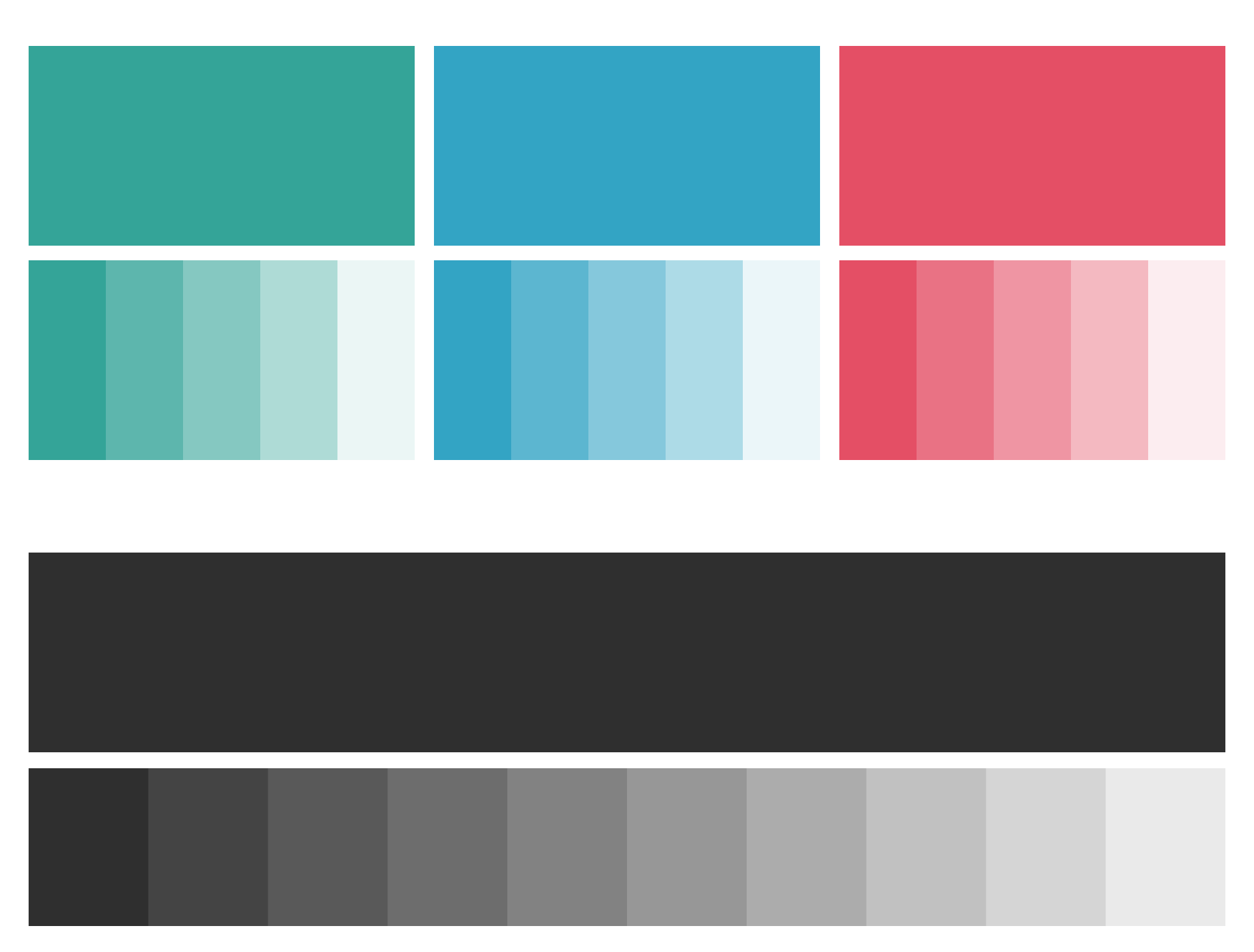
I explored a few color palettes that felt energetic but not too loud. I used smooth curves, custom icons, and simple typography to make it easy to remember and flexible for all use cases. Once the main direction was locked, I refined the type, spacing, and icon structure. The final version highlights the MS initials with subtle icon hints, making it both personal and brand-friendly. Since this was a fresh identity, there was no older version to replace. But comparing early drafts with the final design shows how much cleaner and stronger the logo became after focusing on balance and clarity. The final result gives the brand a strong, modern face that feels ready for the digital space.
Logo Design Process and Final Outcome
The focus was on building the MS symbol in a unique yet clear way. I kept the rest of the brand elements aligned with the same tone.
I explored a few color palettes that felt energetic but not too loud. I used smooth curves, custom icons, and simple typography to make it easy to remember and flexible for all use cases. Once the main direction was locked, I refined the type, spacing, and icon structure. The final version highlights the MS initials with subtle icon hints, making it both personal and brand-friendly. Since this was a fresh identity, there was no older version to replace. But comparing early drafts with the final design shows how much cleaner and stronger the logo became after focusing on balance and clarity. The final result gives the brand a strong, modern face that feels ready for the digital space.
Latest projects
Website
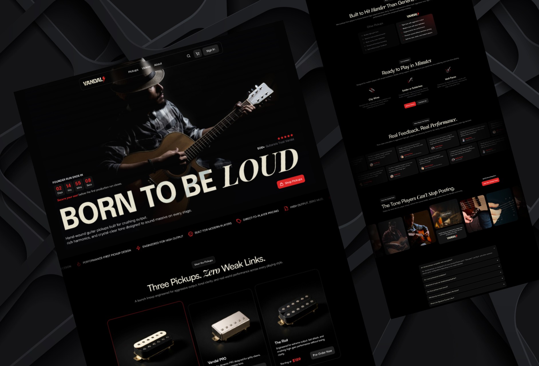
Designing a High-Impact Ecommerce Homepage for Guitar Pickups
Designed a conversion-focused ecommerce homepage for a premium guitar pickup brand, helping players explore products, compare options, and engage with the brand.
Website
Designing a High-Impact Ecommerce Homepage for Guitar Pickups
Designed a conversion-focused ecommerce homepage for a premium guitar pickup brand, helping players explore products, compare options, and engage with the brand.
Website
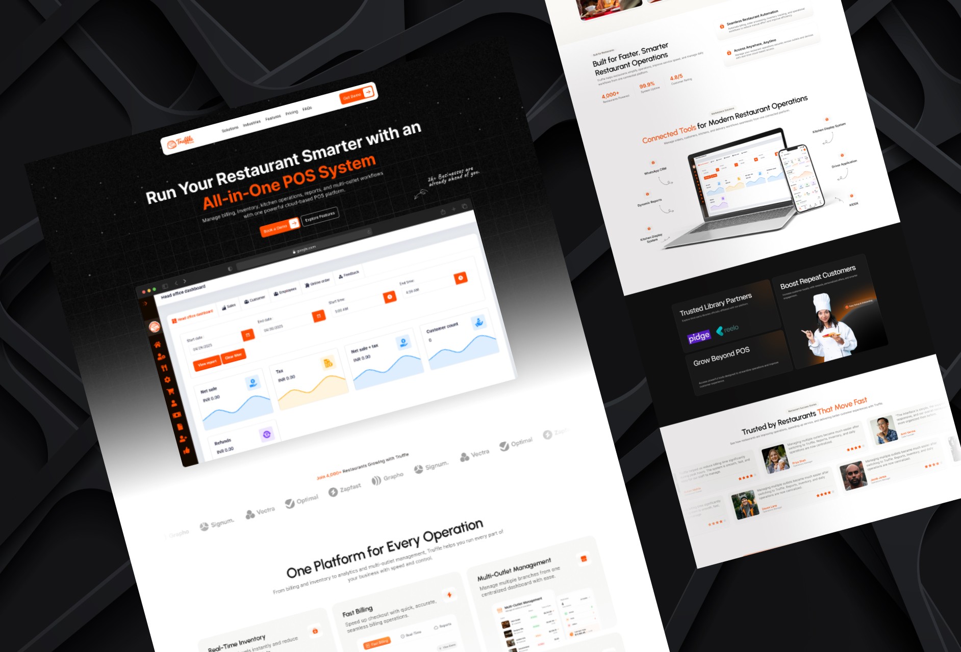
Redesigning a Restaurant POS Website for Better Conversion
Redesigned a restaurant POS homepage to improve product clarity, showcase platform capabilities, and create a stronger conversion-focused experience.
Website
Redesigning a Restaurant POS Website for Better Conversion
Redesigned a restaurant POS homepage to improve product clarity, showcase platform capabilities, and create a stronger conversion-focused experience.
Latest projects
Website
Designing a High-Impact Ecommerce Homepage for Guitar Pickups
Designed a conversion-focused ecommerce homepage for a premium guitar pickup brand, helping players explore products, compare options, and engage with the brand.
Website
Redesigning a Restaurant POS Website for Better Conversion
Redesigned a restaurant POS homepage to improve product clarity, showcase platform capabilities, and create a stronger conversion-focused experience.