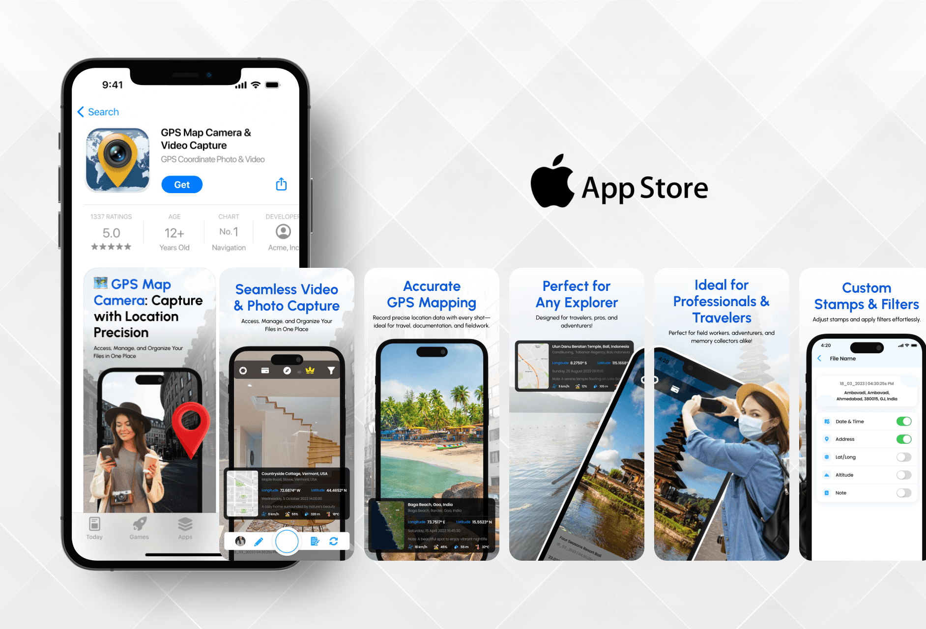
I focused on creating clean and informative visuals that clearly show what the GPS Map Camera app does, while keeping the design trustworthy and easy to follow.

Ajay Jotangiya
UI/UX & Graphics Designer
I focused on creating clean and informative visuals that clearly show what the GPS Map Camera app does, while keeping the design trustworthy and easy to follow.
Ajay Jotangiya
UI/UX & Graphics Designer
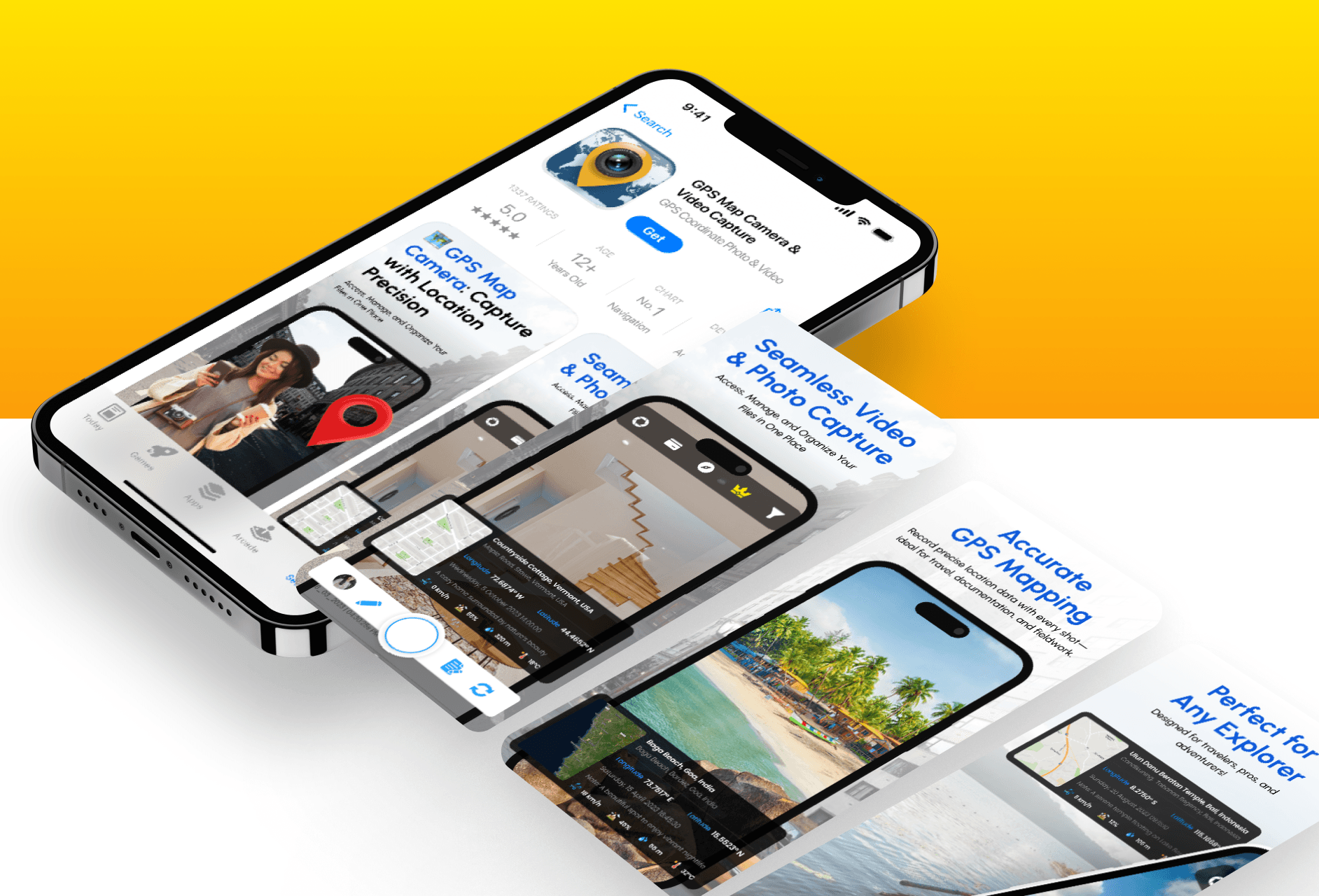
I designed the app icon and App Store screenshots from scratch. The goal was to highlight the app’s core features and make it visually clear and engaging for users in the store.
I designed the app icon and App Store screenshots from scratch. The goal was to highlight the app’s core features and make it visually clear and engaging for users in the store.
Understanding the App’s Core Use
With no reference provided, I based the designs on the app’s purpose and user interface.
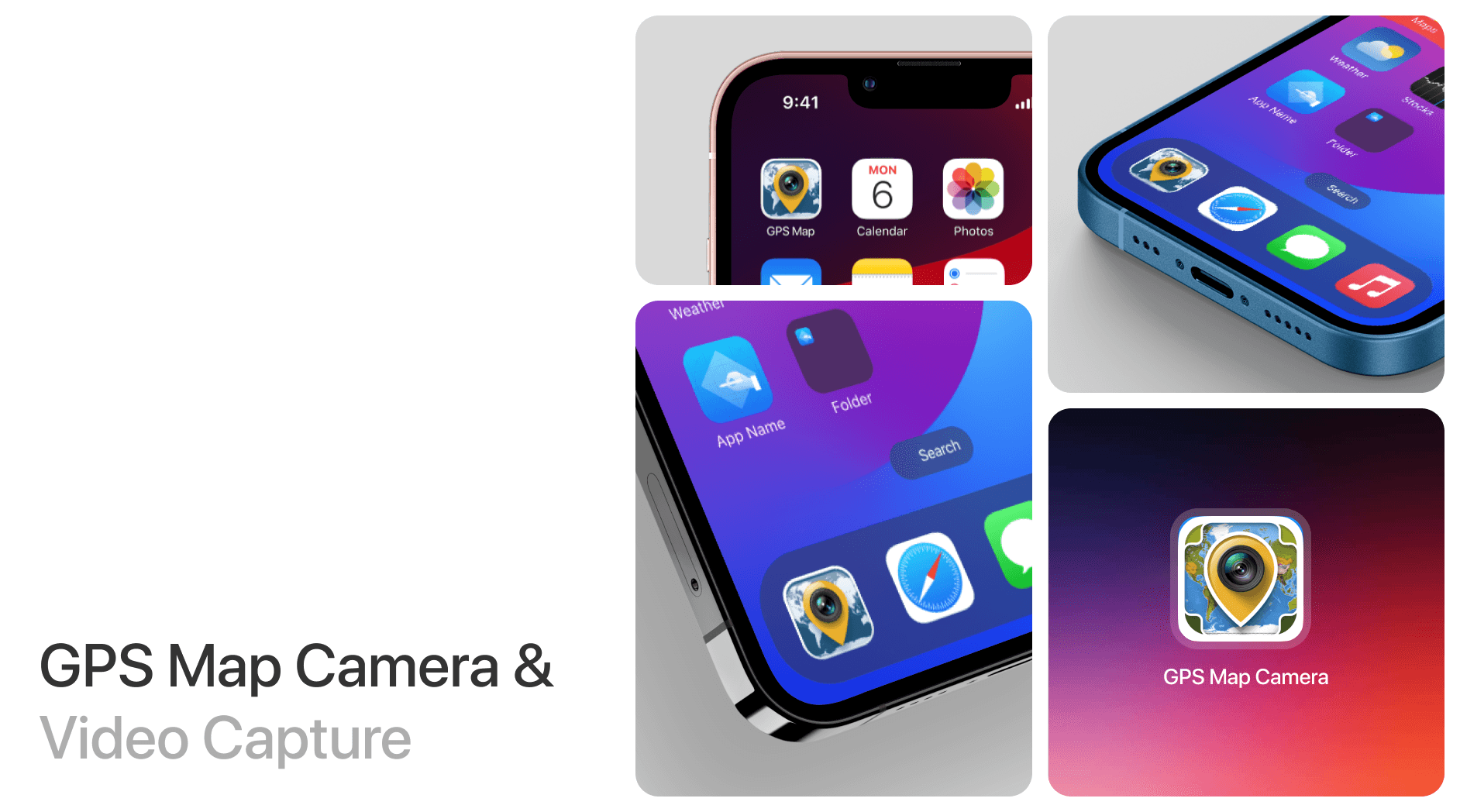
The app helps users capture photos and videos with live GPS data. To start, I explored the app’s actual UI and features to understand how it works. Since there were no previous designs or guidelines, I built the visuals from the ground up. I focused on highlighting features like GPS tagging, time stamps, and map overlays in a clean and simple way. The colors and layout were matched with the app’s UI to keep things consistent and professional.
Understanding the App’s Core Use
With no reference provided, I based the designs on the app’s purpose and user interface.
The app helps users capture photos and videos with live GPS data. To start, I explored the app’s actual UI and features to understand how it works. Since there were no previous designs or guidelines, I built the visuals from the ground up. I focused on highlighting features like GPS tagging, time stamps, and map overlays in a clean and simple way. The colors and layout were matched with the app’s UI to keep things consistent and professional.
Designing for Clarity and Trust
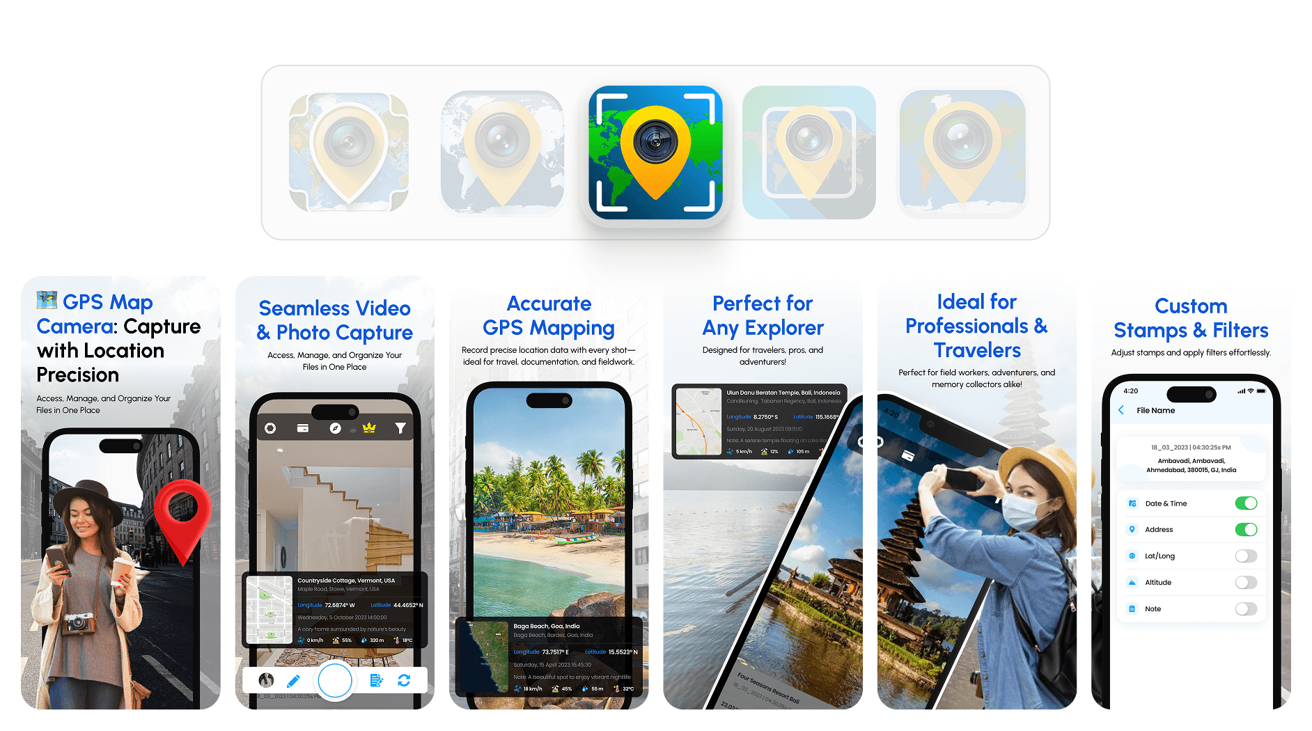
The icon and screenshots were built to feel reliable, easy to scan, and feature-focused.
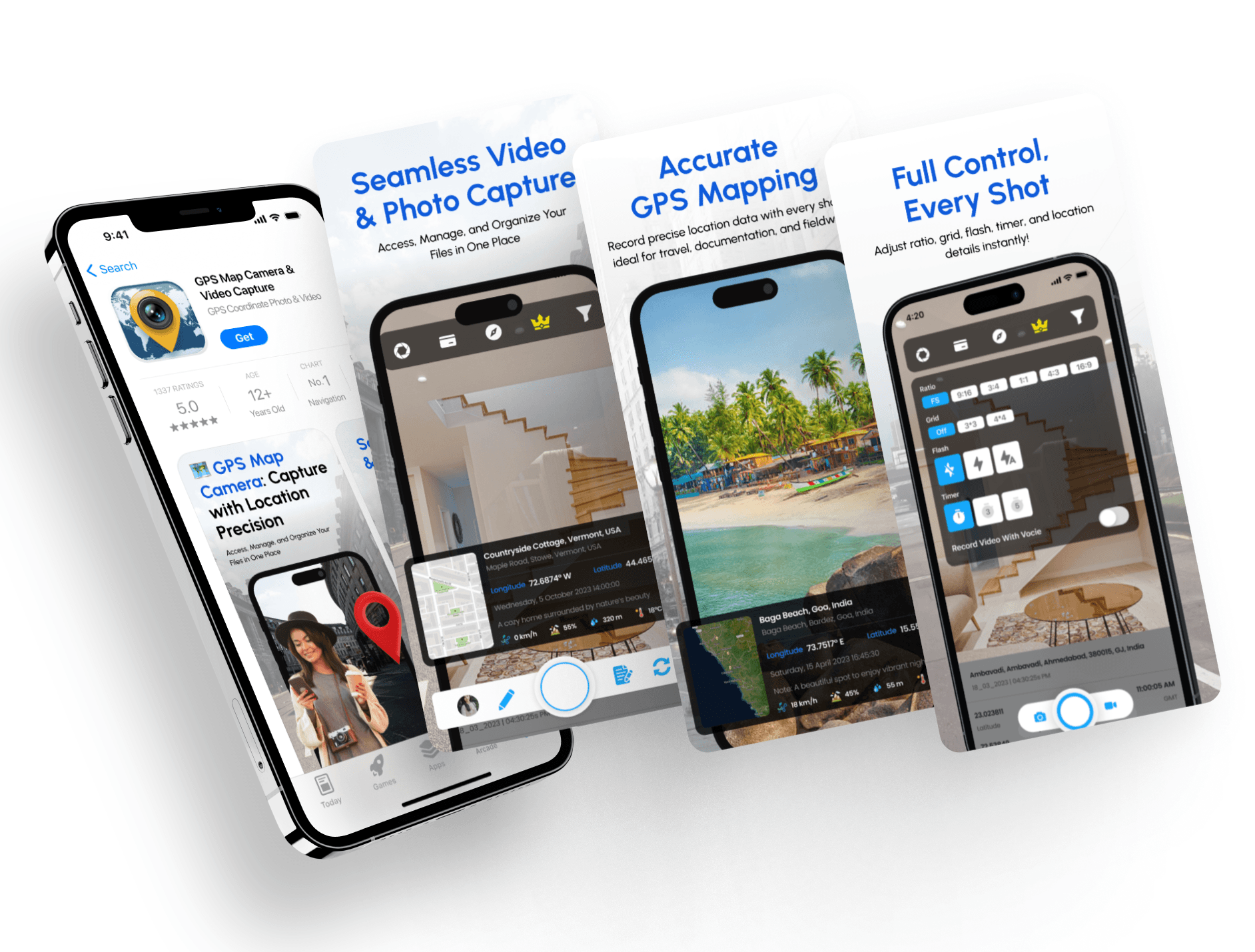
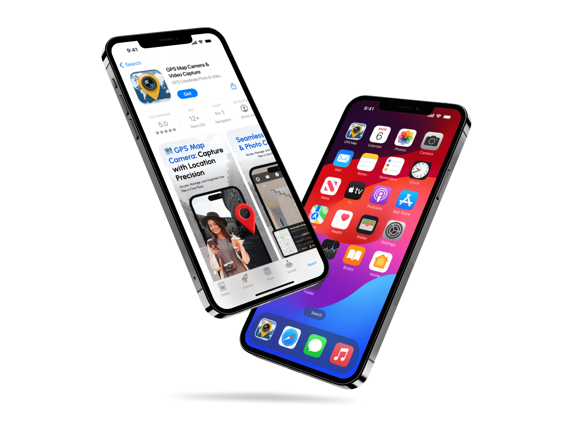
For the app icon, I created a clean visual that reflects location and camera use. It needed to stand out while still feeling connected to the app’s function. The screenshots followed a clear structure, showing real features in action with short, helpful descriptions. Each screen was designed to quickly communicate what the app does and why it’s useful. Since there was no existing visual material, everything was done from scratch. The end result gave the app store page a fresh, polished look. After these UI/UX updates, the presentation felt much stronger and more professional. The client was happy with how it turned out.
Designing for Clarity and Trust
The icon and screenshots were built to feel reliable, easy to scan, and feature-focused.
For the app icon, I created a clean visual that reflects location and camera use. It needed to stand out while still feeling connected to the app’s function. The screenshots followed a clear structure, showing real features in action with short, helpful descriptions. Each screen was designed to quickly communicate what the app does and why it’s useful. Since there was no existing visual material, everything was done from scratch. The end result gave the app store page a fresh, polished look. After these UI/UX updates, the presentation felt much stronger and more professional. The client was happy with how it turned out.
Latest projects
Website
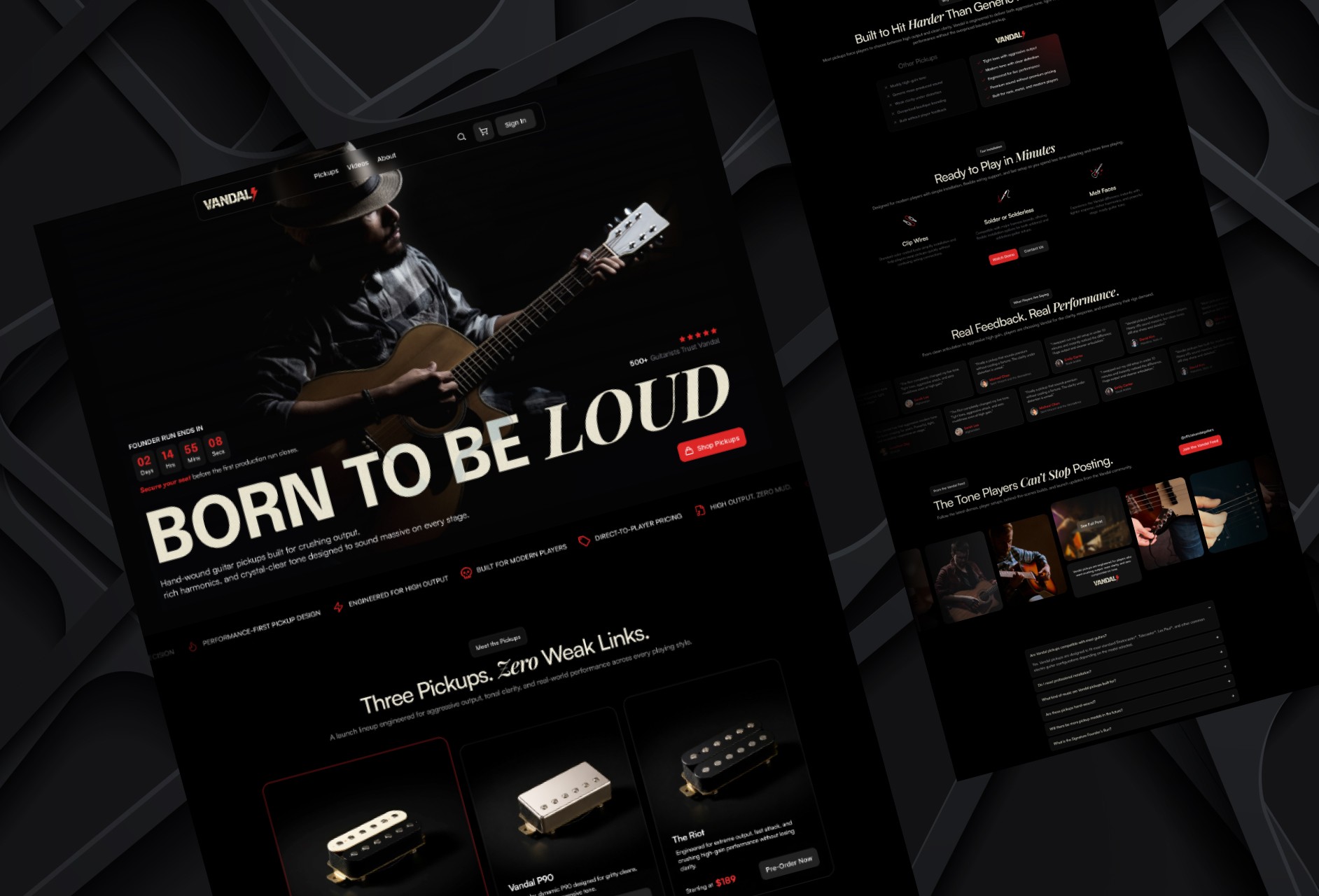
Designing a High-Impact Ecommerce Homepage for Guitar Pickups
Designed a conversion-focused ecommerce homepage for a premium guitar pickup brand, helping players explore products, compare options, and engage with the brand.
Website
Designing a High-Impact Ecommerce Homepage for Guitar Pickups
Designed a conversion-focused ecommerce homepage for a premium guitar pickup brand, helping players explore products, compare options, and engage with the brand.
Website
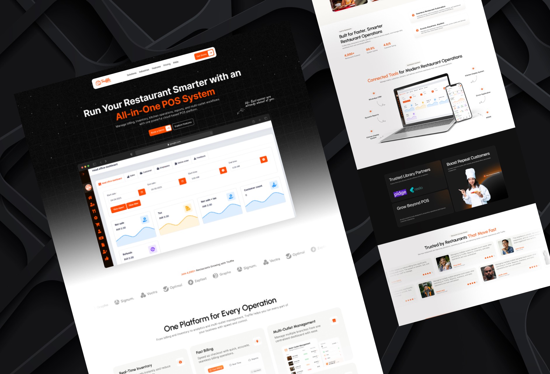
Redesigning a Restaurant POS Website for Better Conversion
Redesigned a restaurant POS homepage to improve product clarity, showcase platform capabilities, and create a stronger conversion-focused experience.
Website
Redesigning a Restaurant POS Website for Better Conversion
Redesigned a restaurant POS homepage to improve product clarity, showcase platform capabilities, and create a stronger conversion-focused experience.
Latest projects
Website
Designing a High-Impact Ecommerce Homepage for Guitar Pickups
Designed a conversion-focused ecommerce homepage for a premium guitar pickup brand, helping players explore products, compare options, and engage with the brand.
Website
Redesigning a Restaurant POS Website for Better Conversion
Redesigned a restaurant POS homepage to improve product clarity, showcase platform capabilities, and create a stronger conversion-focused experience.