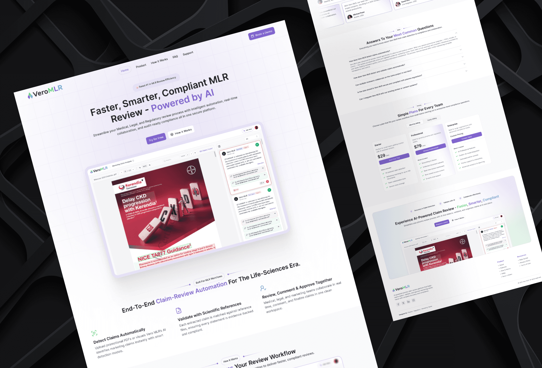
I focused on presenting the product in a way that is easy to understand for pharma teams, with a structure that builds trust and encourages users to request a demo.

Ajay Jotangiya
UI/UX & Graphics Designer
I focused on presenting the product in a way that is easy to understand for pharma teams, with a structure that builds trust and encourages users to request a demo.
Ajay Jotangiya
UI/UX & Graphics Designer
Vero MLR is a pharma-focused review platform used by brand managers, medical reviewers, and compliance teams to review content and claims efficiently. The product did not have a landing page before, so I designed one from scratch to clearly explain what the product does, how it helps, and why it’s reliable. The goal was to communicate value and guide users toward scheduling a demo.
Vero MLR is a pharma-focused review platform used by brand managers, medical reviewers, and compliance teams to review content and claims efficiently. The product did not have a landing page before, so I designed one from scratch to clearly explain what the product does, how it helps, and why it’s reliable. The goal was to communicate value and guide users toward scheduling a demo.
Understanding User Expectations
The users are experienced pharma teams who make critical decisions. They need clarity, not marketing noise. The landing page needed to explain the core workflow and show how the product improves review accuracy and speed.
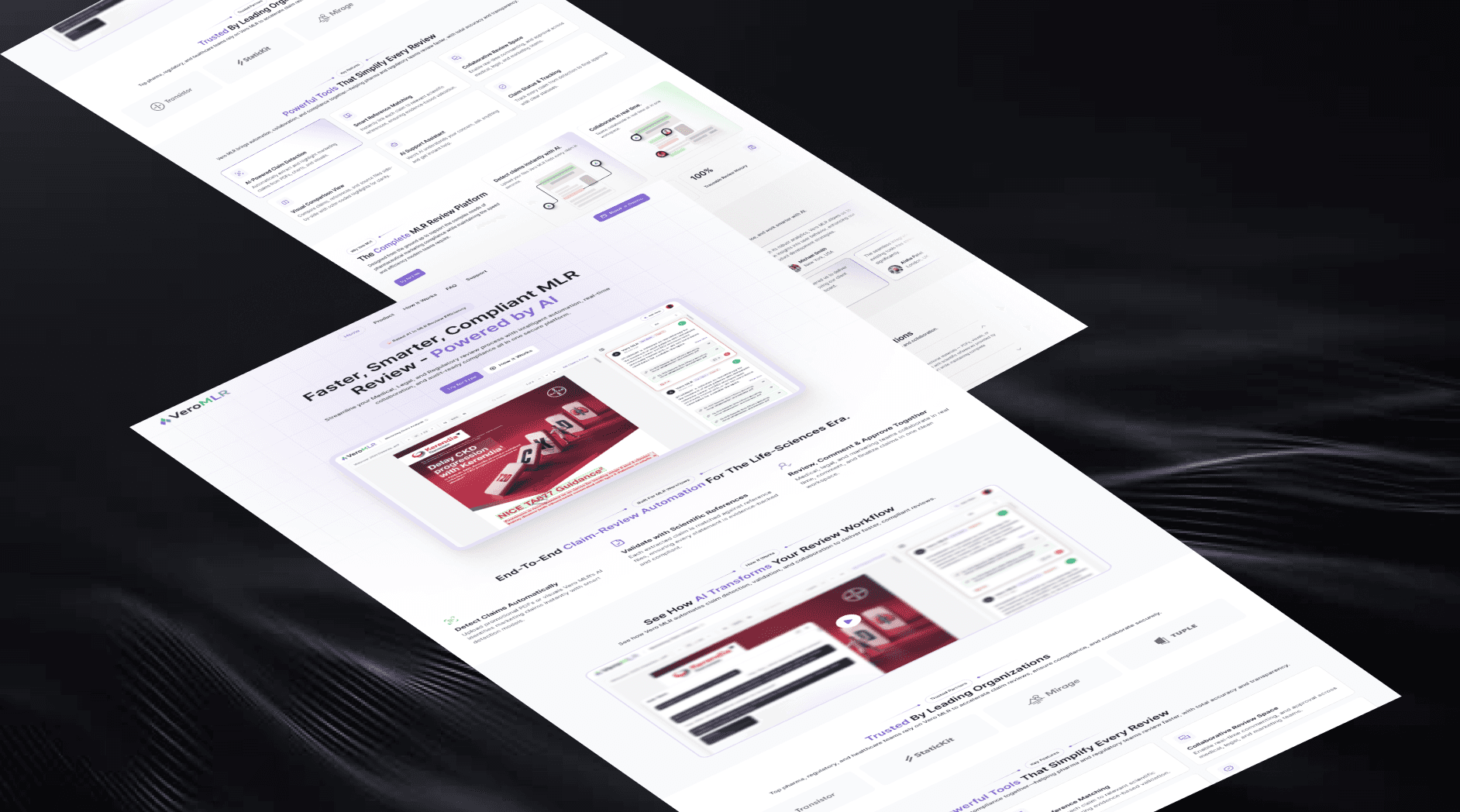
I structured the page to introduce the product purpose first, followed by how it works, and then proof of reliability. Each section was written and arranged so users can understand the platform within a short scroll. I kept the language simple, showed actual interface screens, and highlighted workflow improvements without exaggeration or clutter.
Understanding User Expectations
The users are experienced pharma teams who make critical decisions. They need clarity, not marketing noise. The landing page needed to explain the core workflow and show how the product improves review accuracy and speed.
I structured the page to introduce the product purpose first, followed by how it works, and then proof of reliability. Each section was written and arranged so users can understand the platform within a short scroll. I kept the language simple, showed actual interface screens, and highlighted workflow improvements without exaggeration or clutter.
Design Decisions and Final Structure
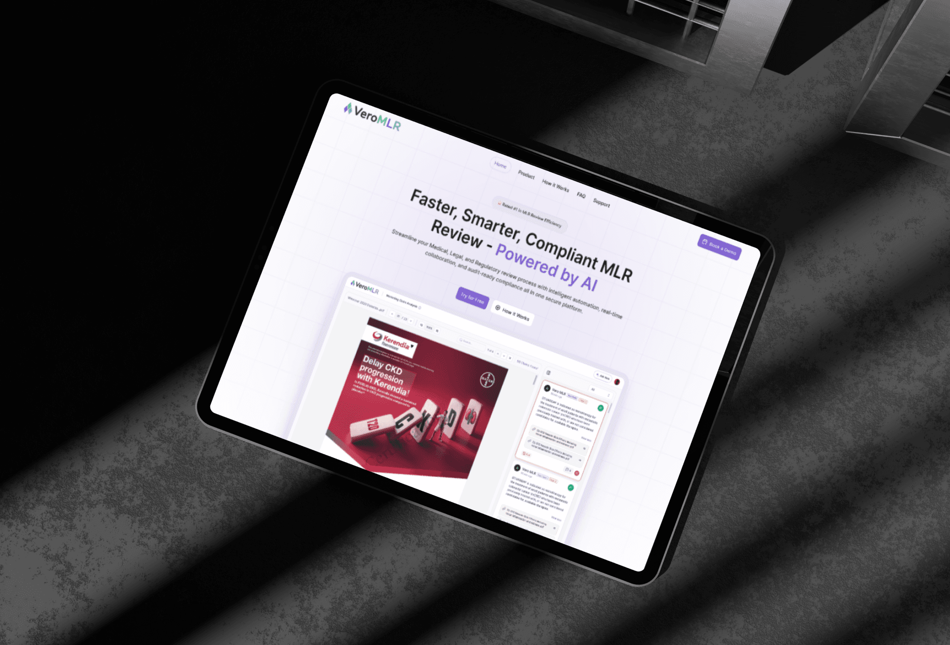
The landing page layout includes a focused hero section with the main value statement, product screenshots, key features, workflow explanation, trust logos, testimonials, pricing, and a clear demo call-to-action. Spacing, typography, and visual rhythm were designed to support calm reading and quick scanning.
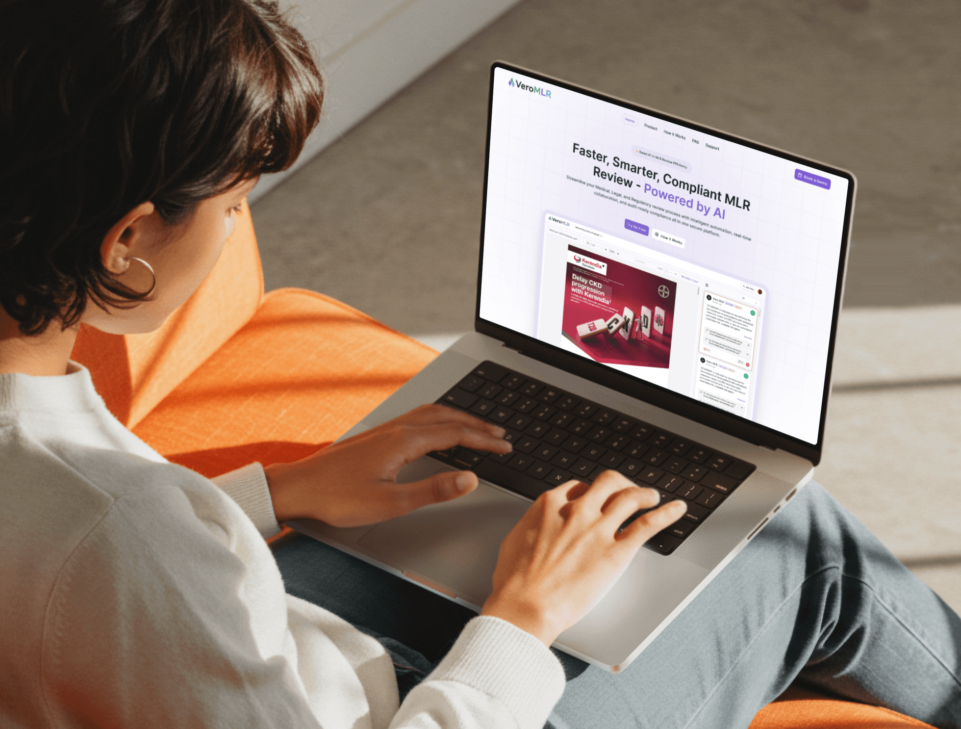
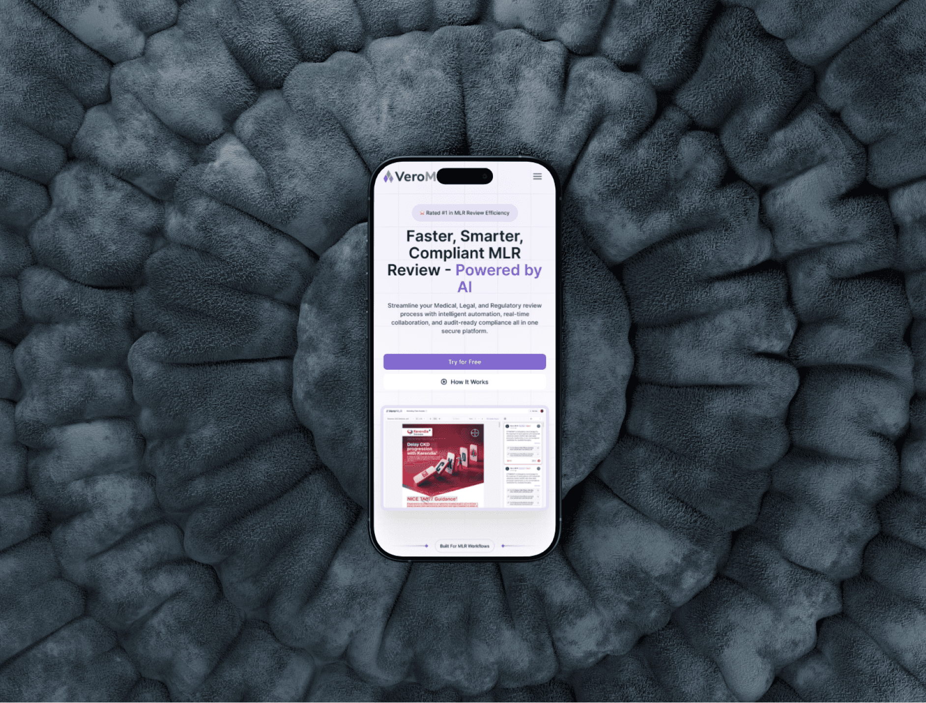
Since there was no previous layout, I built the structure entirely from scratch. The final page guides users from understanding the platform to trusting it, and then taking action. Before this design, the product had no public-facing explanation, which made it harder for teams to assess its value. After the design, the platform has a clear, organized landing presence that communicates what it does, who it is for, and why teams should consider using it. The design supports both desktop and mobile for easy access across devices.
Design Decisions and Final Structure
The landing page layout includes a focused hero section with the main value statement, product screenshots, key features, workflow explanation, trust logos, testimonials, pricing, and a clear demo call-to-action. Spacing, typography, and visual rhythm were designed to support calm reading and quick scanning.
Since there was no previous layout, I built the structure entirely from scratch. The final page guides users from understanding the platform to trusting it, and then taking action. Before this design, the product had no public-facing explanation, which made it harder for teams to assess its value. After the design, the platform has a clear, organized landing presence that communicates what it does, who it is for, and why teams should consider using it. The design supports both desktop and mobile for easy access across devices.

Latest projects
Website
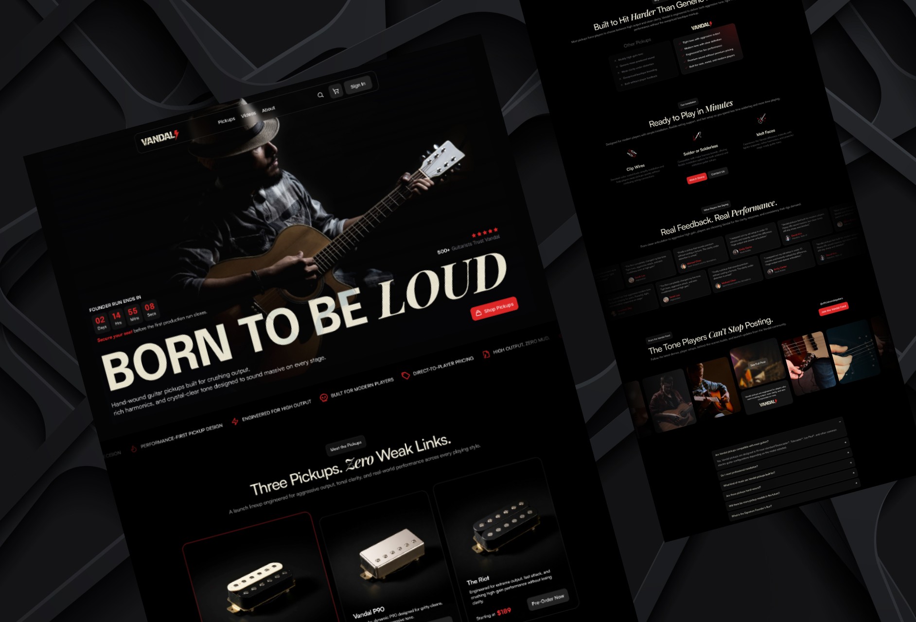
Designing a High-Impact Ecommerce Homepage for Guitar Pickups
Designed a conversion-focused ecommerce homepage for a premium guitar pickup brand, helping players explore products, compare options, and engage with the brand.
Website
Designing a High-Impact Ecommerce Homepage for Guitar Pickups
Designed a conversion-focused ecommerce homepage for a premium guitar pickup brand, helping players explore products, compare options, and engage with the brand.
Website
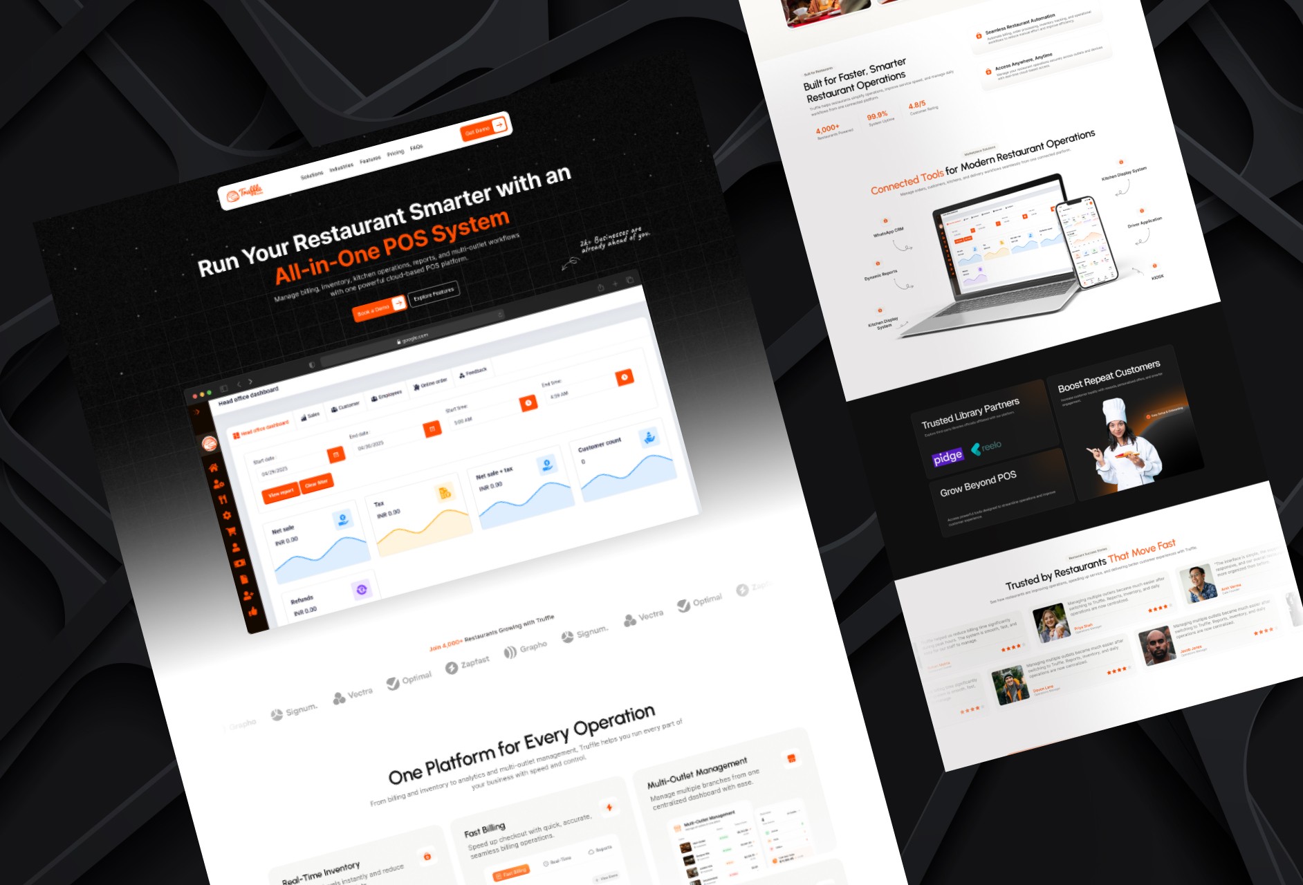
Redesigning a Restaurant POS Website for Better Conversion
Redesigned a restaurant POS homepage to improve product clarity, showcase platform capabilities, and create a stronger conversion-focused experience.
Website
Redesigning a Restaurant POS Website for Better Conversion
Redesigned a restaurant POS homepage to improve product clarity, showcase platform capabilities, and create a stronger conversion-focused experience.
Latest projects
Website
Designing a High-Impact Ecommerce Homepage for Guitar Pickups
Designed a conversion-focused ecommerce homepage for a premium guitar pickup brand, helping players explore products, compare options, and engage with the brand.
Website
Redesigning a Restaurant POS Website for Better Conversion
Redesigned a restaurant POS homepage to improve product clarity, showcase platform capabilities, and create a stronger conversion-focused experience.